How to Mix Colors: A Painter's Guide to Mixing Any Color Without Mud
Almost every color you will ever need comes from three primaries plus white. The trick is not memorizing recipes. It is understanding undertones, so your mixes stay clean instead of sliding into mud.

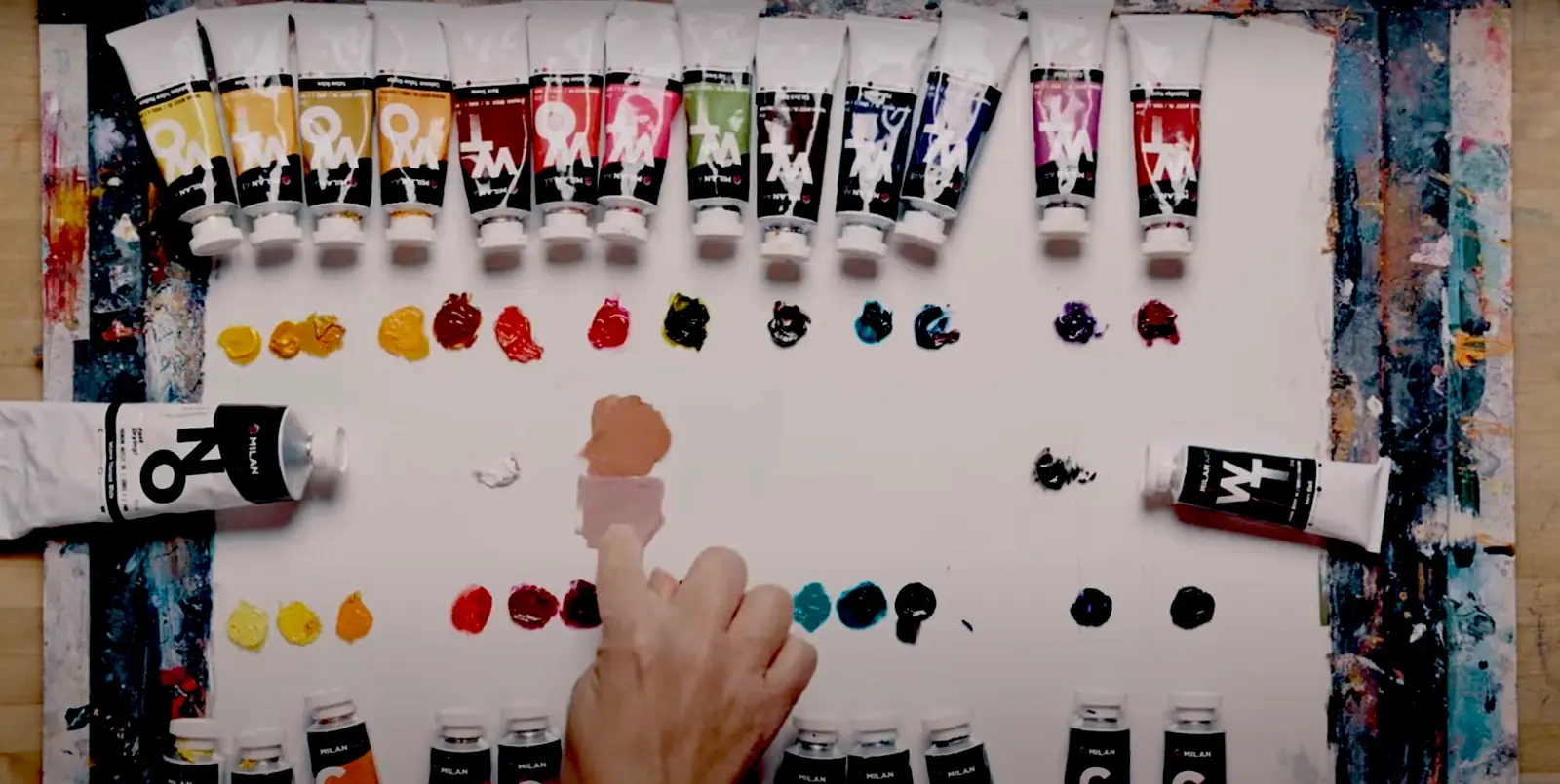
You can mix almost every color you will ever paint from three primaries plus white. Red, yellow, and blue combine into the secondaries, tertiaries, browns, and grays that make up a full painting, and once you understand how they behave, you stop reaching for a new tube every time you need a shade. The part nobody tells beginners is that the recipe is the easy half. The reason a mix comes out clean or muddy is undertone, the small warm or cool bias hiding inside every pigment. Learn to read that, and color mixing turns from guesswork into something you control.
This guide is the practical companion to the theory. If you want the why behind the wheel, temperature, and harmony, start with color theory for artists and the color wheel for painting. Here we stay at the palette: which colors to buy, how to mix each family, and how to keep every mix from sliding into mud.
What does it mean to mix colors well?
Mixing colors well means getting the exact hue you pictured, at the value and intensity you need, without dulling it by accident. Paint mixing is subtractive, which is the first thing to understand. Every pigment absorbs part of the light that hits it and reflects the rest, so each color you add to a pile takes more light away. That is why a mix of many colors trends toward gray or brown, and why the cleanest mixes use the fewest pigments that will do the job.
Good mixing rests on three decisions you make every time: hue (which color), value (how light or dark), and saturation (how intense or grayed). Beginners tend to chase hue and ignore the other two, then wonder why the painting looks flat. Once you can adjust all three on purpose, color stops being something you hope works and becomes a tool you shape. Mixing sits alongside the other painting techniques that shape a surface, and it is the one that decides whether the rest of them read as clean or muddy.
Which colors can you not mix?
The three primaries, red, yellow, and blue, are the colors you cannot create from anything else, so every palette starts there. From those three plus white you can reach a remarkable range. The catch is that a single red, yellow, and blue cannot mix every hue cleanly, because each pigment leans slightly warm or cool, and that lean limits which secondaries come out bright.
The fix most working painters use is a warm and a cool version of each primary. That gives you six colors plus white, and it is the most flexible starter palette there is:
- A warm red and a cool red. A warm red like cadmium red leans toward orange; a cool red like alizarin crimson or quinacridone magenta leans toward purple.
- A warm yellow and a cool yellow. A warm yellow like cadmium yellow deep leans orange; a cool yellow like lemon or cadmium yellow light leans green.
- A warm blue and a cool blue. A warm blue like ultramarine leans purple; a cool blue like phthalo or cerulean leans green.
- White. Titanium white for opaque tints, or zinc white in oils when you want a softer, more translucent lightening.
With that set, mixing any color becomes a matter of choosing the version of each primary that leans toward the color you want. That single idea, covered in depth on the color wheel for painting, does more for your mixing than any list of recipes.
How do you mix the secondary colors?
Each secondary color comes from two primaries, and the cleanest version uses the two primaries that both lean toward it. Orange, green, and purple are the three secondaries, and here is the reliable recipe for each:
- Orange: red and yellow. A warm red and a warm yellow, such as cadmium red and cadmium yellow, give the brightest orange, because neither pigment is dragging blue into the mix. Full walkthrough in how to make orange.
- Green: yellow and blue. A cool yellow and a cool blue keep green vivid, while a warm, orange-leaning yellow will gray it. The exact pairs are in how to make green.
- Purple: blue and red. A cool blue like ultramarine with a cool red like alizarin crimson mixes a glowing violet, while warm reds turn it brown. The pigment logic is in how to make purple.
Notice the pattern: for a bright secondary, both primaries should lean toward the secondary you want, and neither should carry the third primary as an undertone. That one rule explains most muddy secondaries before you ever mix them.
How do you mix tertiary and in-between colors?
Tertiary colors come from mixing a primary with the secondary next to it, which gives you the subtle, natural hues real paintings live on. Red orange, yellow green, blue green, blue violet, red violet, and yellow orange are the six tertiaries, and they are where mixing gets expressive. To reach any in-between color, start with the nearest secondary or primary and nudge it toward its neighbor a little at a time.
The practical move is to mix toward your target, not at it. If you want a warm foliage green, mix a clean green first, then walk it toward yellow with a touch of warm yellow. If you want a dusky teal, start from blue green and cool it with more blue. Adding pigment in small amounts, checking against your reference, and stopping the moment it lands keeps you from overshooting into a color you then have to rescue.
How do you mix browns and neutral grays?
Browns and grays are just neutralized color, and the best ones come from mixing two complements rather than reaching for a brown or black tube. Complements are the pairs opposite each other on the wheel: blue and orange, red and green, yellow and purple. Mixed toward balance, they cancel each other’s intensity and settle into browns and grays that still hold light and temperature.
- Warm brown: start from orange (or a red and yellow mix) and gray it down with a little blue.
- Cool gray: mix blue and orange close to balance, then adjust with white for value.
- Green-gray or olive: neutralize a green with a touch of its complement, red.
The reward for mixing neutrals this way is enormous. A brown or gray you mixed from complements shifts warm and cool across a passage, which reads as living form, while a flat tube brown sits dead on the canvas. This is exactly the thinking behind believable skin tones, which are built almost entirely from mixed browns and grays, not from a single flesh color.
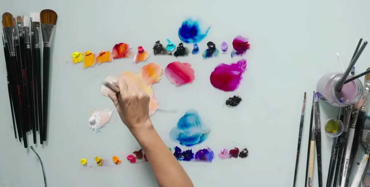
Why do your colors keep turning to mud?
Muddy color has two usual causes: clashing undertones and too many pigments in one pile. The undertone problem is the one that catches people out. A red that leans yellow, mixed with a blue that leans green, drags a trace of every primary into the mix, and any color that contains a little of all three primaries neutralizes toward gray or brown. That is not a mixing mistake so much as a pigment-choice mistake, and it is fixable the moment you match undertones.
The second cause is simpler: the more colors you stir together, the more light the mix absorbs, so keep working mixes to two or three pigments whenever you can. When a color does go dull, resist the urge to fix it by adding more colors, which usually deepens the problem. Set it aside, mix a fresh, cleaner version alongside it, and compare. Nine times out of ten the clean mix is a two-pigment mix with matched undertones.
How do you lighten and darken a color without killing it?
Lighten a color by adding white, and darken it by adding a darker analogous color or a touch of its complement, not by reaching for black. White raises value but also lowers saturation and cools most colors slightly, so mix a hair more intense than your target before you add it. In acrylics, remember the mix dries a shade darker than it looks wet, so aim a little lighter.
For darks, black is a blunt tool that flattens and grays everything it touches. Deepen a color instead with a darker relative (a deeper blue into a blue, burnt sienna into a warm passage) or with a small amount of its complement, which darkens while keeping the color alive. Reserve black, if you use it at all, for tiny accents at the very end. Your shadows will hold color and depth instead of turning into holes.
A simple order of operations at the palette
When you sit down to mix for a painting, a consistent process keeps every color connected and clean:
- Lay your palette out in the same order every time, warm to cool, so relationships are visible at a glance.
- Identify the target color’s hue, value, and saturation before you mix, ideally by squinting at your reference.
- Choose the two primaries (or a secondary plus a neighbor) whose undertones lean toward your target.
- Mix the hue first with a palette knife, which blends evenly and cleans up fast, then adjust value with white and saturation with a touch of complement.
- Test the swatch next to your reference and against the surrounding colors before committing it to the canvas.
That sequence sounds slow, but it becomes automatic within a few paintings, and it is the difference between a palette that stays clean all session and one that turns into a gray soup by the second hour.
Quick answer: how to mix colors
You mix colors from three primaries plus white: two primaries make a secondary, a primary plus its neighbor makes a tertiary, and two complements make your browns and grays. Clean mixes come from matching undertones and keeping to two or three pigments; lighten with white, darken with a complement or a darker relative rather than black. Master undertones and you can mix nearly any color on purpose.
Final thoughts
Color mixing is not a talent you are born with. It is a skill built on one idea, undertone, applied over and over until it becomes instinct. Once you can look at a color and know which two pigments will get you there, the whole palette opens up, and paintings that used to feel like a gamble start to feel like decisions.
The fastest way to make this real is to put it into practice. Our free Two Week Challenge gets a brush in your hand right away with real color work, and the full oil painting techniques hub has a guide for every color family whenever you want to go deeper.
Frequently asked questions
What colors do you need to mix any color?
You need the three primaries, red, yellow, and blue, plus white. From those you can mix every secondary and tertiary color, along with your browns and grays. Many painters carry a warm and a cool version of each primary, which is six colors plus white, because that gives you a clean route to almost any hue on the wheel.
How do you mix colors without making mud?
Mud comes from mixing pigments with clashing undertones, or from stirring too many colors into one pile. Keep mixes to two or three pigments, match undertones (cool with cool for bright secondaries), and mix your neutrals on purpose from complements rather than by accident. When a color goes dull, it is usually a hidden warm or cool bias in one tube, not the recipe.
What two colors make each secondary color?
Red and yellow make orange. Yellow and blue make green. Blue and red make purple. Those are the three secondary colors. The exact red, yellow, and blue you pick decides whether the secondary comes out bright or grayed, because each pigment leans slightly warm or cool.
How do you mix brown and gray?
Mix two complements together, colors that sit opposite on the wheel, such as blue and orange or red and green. In balance they neutralize into rich browns and grays that still hold color and light. This gives you far more alive neutrals than black straight from the tube, which tends to deaden a mix.
Is color mixing the same in acrylic and oil?
The mixing logic is identical, because it is the pigments that decide the hue, not the binder. The differences are practical: acrylics dry fast and slightly darker than they look wet, so mix a touch lighter; oils stay open for hours, so you can adjust and blend on the canvas. Every recipe here works in both.
What to practice this week
- Mix a full secondary set from only your primaries: orange, green, and purple. Then mix each one again using a warmer or cooler version of one primary, and line the six swatches up to see how undertone changes everything.
- Make a brown and a gray without touching black or a brown tube. Use blue and orange for one, red and green for the other, and adjust until they feel warm and alive rather than flat.
- Take one bright color and build a five-step value scale by adding white one touch at a time, so you can see exactly where a color starts to chalk out.
Supplies used

About the author
More from Elli