What Colors Make Orange? The Right Red and Yellow (and How to Tame It)
Orange is the easiest secondary to mix and the easiest to overdo. Here is how to mix a clean orange from red and yellow, then warm it, cool it, and gray it into believable earth tones.

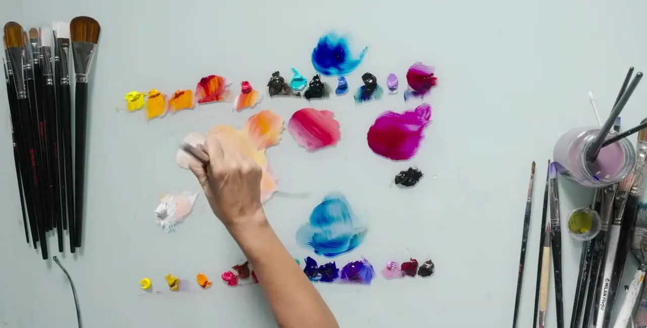
Red and yellow make orange. It is the most forgiving secondary to mix, because both parents are warm and neither is fighting the other, which is why orange is often the first color beginners mix cleanly. The refinements come after: the exact red and yellow decide how hot or how soft the orange runs, and a touch of the wrong pigment tips it toward brown. This guide covers the pigments that mix a clean orange in acrylics and oils, plus how to warm it, cool it, lighten it into peach, and gray it into the terracotta and rust tones that do so much of the work in a painting.
What colors make orange?
A warm red and a warm yellow make the brightest, cleanest orange, with cadmium red and cadmium yellow as the classic pair. The textbook answer of red plus yellow holds, but the undertone of each pigment sets the final hue. Warm reds and yellows lean toward orange already, so they mix vivid, while cool reds and yellows carry a trace of blue that grays the orange down.
Once you have a clean base orange, the whole family opens up. More yellow gives a light amber; more red gives a deep, hot orange. A touch of white lifts it into peach and apricot, and a touch of blue, orange’s complement, grays it toward terracotta and burnt orange. The same undertone thinking runs through every mix on your palette, which is why it pays to learn once and reuse everywhere. The full method is in how to mix colors.
Why does your orange turn brown?
Brown orange comes from a blue undertone creeping into the mix. Cool reds like alizarin crimson lean toward purple, and cool yellows like lemon yellow lean toward green, and both of those leans contain a little blue. Since blue is orange’s complement, even a trace of it starts neutralizing the mix toward brown. The fix is simple: reach for a warm, orange-leaning red and a warm, orange-leaning yellow, and the same ratio mixes clean.
Your medium plays a small part too. Acrylics dry a shade darker than they look wet, so an orange that reads perfect on the palette can land heavier on the canvas; mix a touch brighter to compensate. For the wider logic of warm and cool pigments, the color wheel for painting lays it out.
How do you make orange with acrylic paint?
Start with your yellow, add red gradually, and adjust until the orange sits where you want it. Here is the full process:
- Begin with a warm yellow such as cadmium yellow as your base.
- Add a warm red like cadmium red a little at a time. Yellow first, red second, gives you more control over the balance.
- Adjust the ratio. More yellow lightens and warms toward amber, more red deepens toward a hot orange.
- Add titanium white for a peach or apricot tint.
- Mix slightly brighter than your target, because acrylics dry darker than they look wet.
A palette knife blends the pigments evenly and keeps the mix clean. If the orange comes out too loud, gray it with the smallest touch of blue rather than a lot of it, since blue neutralizes orange fast. For mixing and mark making both, our guide to palette knife painting techniques is a useful next step.
How do you mix orange with oil paint?
Start with cadmium yellow, work in cadmium red, and use oil’s long open time to fine-tune the temperature on the canvas. Oil oranges are flexible because you can blend wet into wet for hours, warming a passage with more yellow or cooling it with a whisper of blue as the painting develops.
Two shortcuts help with oil oranges. Yellow ochre mixed toward orange gives you an instant muted, earthy tone, useful for autumn foliage and warm ground. And burnt sienna is essentially a deep, grayed orange already, so a little of it will push a bright orange straight toward a rich terracotta. If you are weighing oil against acrylic for color work, start with the 5 key differences between acrylics and oil paint.
How do you make natural oranges and earth tones?
Most useful oranges in a painting are grayed, not fully saturated, so the skill is knowing how to knock a bright orange back without killing it. Pure orange is one of the most attention-grabbing colors on the wheel, so unmixed it tends to dominate. Muted oranges do the real work: terracotta, rust, ochre, and amber carry warmth without shouting. To get there:
- Gray toward terracotta with a small touch of blue, orange’s complement.
- Deepen toward rust by adding a little more red and a touch of blue together.
- Warm toward amber with more yellow and a dab of white.
- Push toward burnt orange by lowering the value with its complement rather than with black.
Grayed oranges are invaluable next to blues and greens, where a small warm accent makes a cool painting come alive. This complement thinking, using blue to control orange, is the same logic behind mixing believable browns and skin tones.
Why does orange carry so much energy?
Orange has signaled warmth, energy, and vitality across the history of art. It is the color of fire, of autumn, of sunset, and painters have used it to bring heat and life into a composition for centuries. In color psychology it reads as enthusiastic and inviting, which is why even a small amount can lift the mood of a whole painting.
You can trace that through famous work. The Impressionists and Post-Impressionists loved orange for exactly this reason: Van Gogh set glowing oranges against deep blues to make his skies and fields vibrate, using the complementary pair to push both colors harder. Turner filled sunsets with molten orange light. If the meaning behind color choices interests you, our guide to the symbolism of color goes deeper.
A clean, controllable orange rounds out your grasp of the secondary colors, alongside green and purple. The same undertone thinking runs through all of them. You will find more color and paint handling guides in our oil painting techniques hub. And if you want to practice color mixing with real feedback from a working artist, the free Two Week Challenge is a friendly place to start.
Frequently asked questions
What two colors make orange?
Red and yellow make orange. For the brightest, cleanest orange, use a warm red like cadmium red with a warm yellow like cadmium yellow, since neither one carries a blue undertone that would gray the mix. Cooler reds and yellows still make orange, but a softer, more muted one.
Why does my orange look dull or brown?
A blue undertone is creeping in. Cool reds like alizarin crimson lean toward purple, and cool yellows like lemon lean toward green, and both carry a trace of blue that grays orange toward brown. Switch to a warm red and a warm yellow and the same ratio mixes a clean, vivid orange.
How do you make different shades of orange?
Change the ratio and the temperature. More yellow gives a light, warm amber; more red gives a deep, hot orange. Add white for a peach or apricot tint, and add a touch of blue, orange's complement, to gray it toward terracotta, rust, and burnt orange.
How do you make burnt orange?
Mix a clean orange first, then gray and deepen it with a small amount of its complement, blue, or with a touch of burnt sienna. Burnt orange is simply a muted, darker orange, so the move is to knock back the brightness and lower the value without turning it fully to brown.
Is mixing orange the same in acrylic and oil?
Yes, the red-and-yellow logic is identical. Acrylics dry a shade darker, so mix a touch lighter than your target, and oils give you longer to adjust the warmth on the canvas. The pigments decide the hue in both mediums; only the working time changes.
What to practice this week
- Mix two oranges side by side: cadmium red with cadmium yellow, then alizarin crimson with lemon yellow. Watch how the cool pair mixes a grayer, browner orange.
- Take one bright orange and gray it in three steps by adding a little blue at a time, watching it travel from vivid toward terracotta and rust.
- Build a peach and apricot scale by adding white to your cleanest orange one touch at a time, so you can see where it turns pastel.
Supplies used
About the author
More from Elli