Good vs. Bad References: Value, Light, Cropping, and Clarity
A powerful painting rarely happens by accident. It starts with the reference, and how you read it. These are the four fundamentals that separate a strong reference from a weak one.

What separates a strong painting from a struggling one usually comes down to the reference and how you read it. A strong reference holds its value pattern when you squint, carries light from one consistent direction, can be cropped with intention, and points the eye to one clear place. A weak reference goes muddy, scatters its light, and treats every area as equally important. When an artwork feels powerful, clear, and intentional, it is rarely accidental. Behind it sits a foundation of sound decisions, and those decisions begin before the first brushstroke.
Whether you work from photos, from life, or from imagination, the quality of your reference and how you interpret it will directly shape your results. The gap between a painting that feels confident and one that feels unresolved often traces back to four fundamentals: value, light, cropping, and clarity. None of them are mysterious, and all of them are teachable. Here is what each one actually does, and how to read a reference through it.
What makes value the foundation of a strong reference?
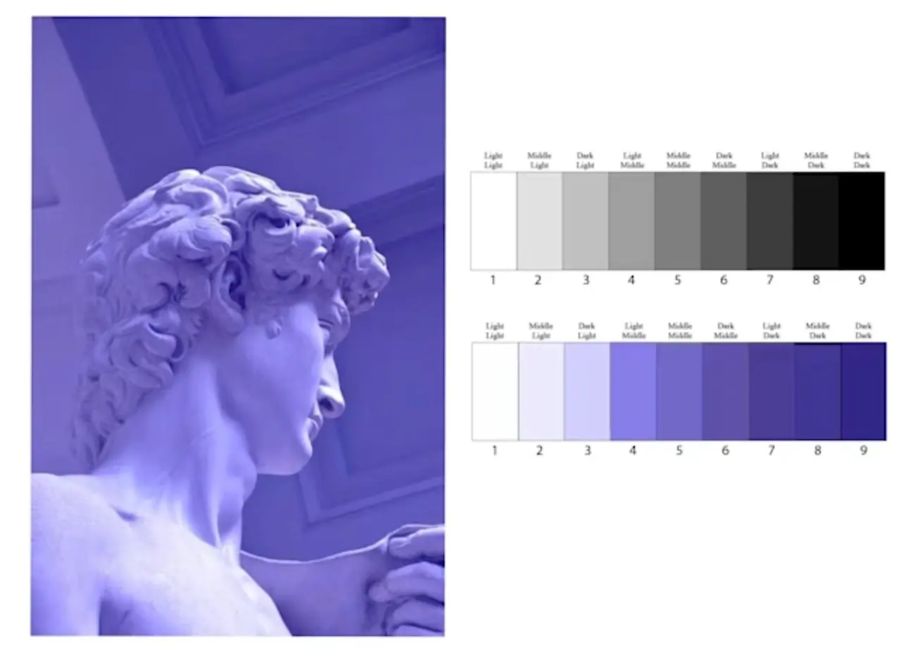
Value is the backbone of every successful artwork, which is why it comes first. Value is simply how light or dark something is, and it carries more of the image than color does. If you squint at your reference and it dissolves into a muddy gray blur, the structure is weak. If you squint and clearly see distinct light and shadow shapes, the structure is strong.
Strong artists simplify before they render. They organize the image into a few clear value families, the lights and the darks, before thinking about color or small details. When the value pattern is clear, the painting immediately feels more dimensional and cohesive. When it is unclear, no amount of careful detail will save it. This is also why so many painters work from dark to light, building structure first and letting the light shapes land on top.
The test is fast. Squint at the reference until the detail drops away. If a clear pattern of light and shadow remains, you have something to build on. When the value works, the painting works.
Why does light direction matter so much?
Light creates depth, mood, and believability, and a strong reference has one dominant light source you can clearly follow. The shadows fall consistently, the forms turn naturally, and the scene feels like it could exist. That single clear light story is doing most of the work of making a painting feel real.
When light is unclear or inconsistent, paintings tend to feel flat or confusing. Highlights scatter, shadows lose their authority, and the viewer cannot fully read the form. Light is not decoration sitting on top of the image. Light is what defines structure, which is why a reference shot under flat, even light is so much harder to paint than one with a clear direction.
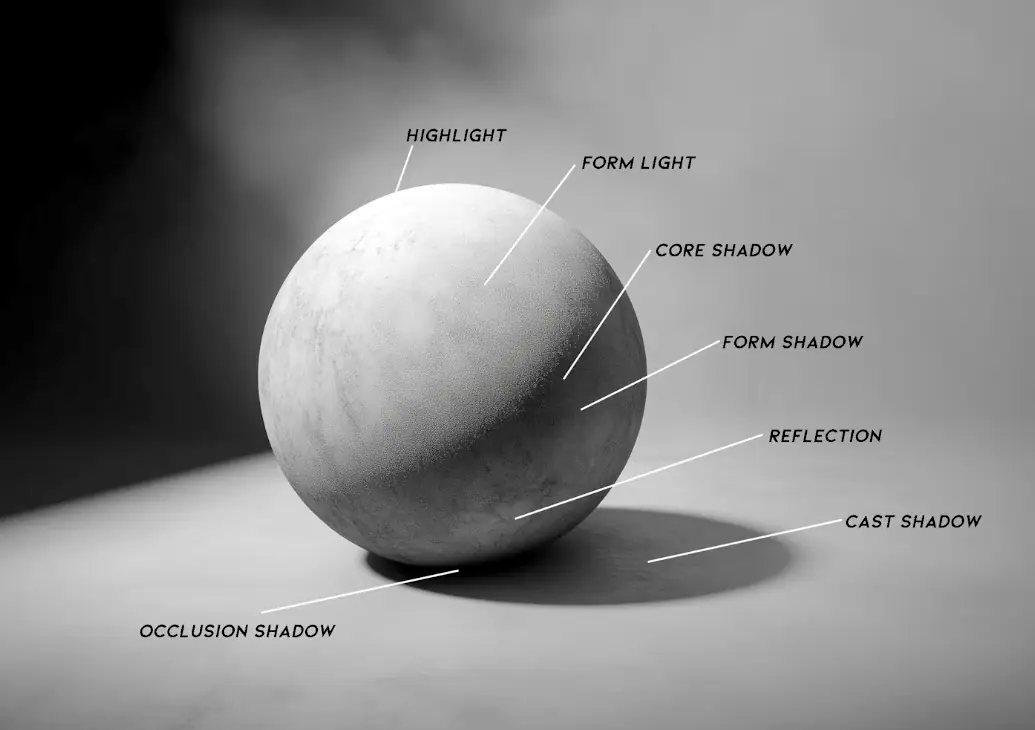
When you choose a reference, look for the light first. The clearer the light story, the stronger the artwork that can come out of it. If you are building your own reference photos for painting, shooting with one directional light source is one of the simplest ways to make every reference easier to use.
How should you crop and design from a reference?
Crop and design with intention, because a reference is a starting point and not a limitation. You are not a camera, you are a designer. Strong artists make compositional decisions rather than accepting whatever the lens captured: they crop strategically, remove distractions, shift focal points, and simplify shapes.
The shift here is from copying to designing. Instead of reproducing everything the camera recorded, you decide what the painting actually needs, then cut everything that does not serve it. A cluttered background, a competing object, an awkward edge near the corner, all of it is yours to remove. Intentional cropping is often the difference between an ordinary image and a compelling composition, and it is one of the most underused skills a beginner has access to. If you want the full toolkit, our guide to composition in art covers how to arrange those shapes once you have cropped them.
The reference gives you raw material. The crop is where you start making it a painting.
How does clarity guide the viewer’s eye?
Clarity comes from hierarchy, which means deciding where the viewer should look first and then supporting that decision. Every successful painting has a clear focal point. Contrast, edges, and detail should all reinforce that one place, while the rest of the image stays quieter on purpose.
When everything is rendered equally, with the same contrast and the same level of detail everywhere, the eye gets overwhelmed and has nowhere to rest. When a hierarchy is present, the artwork feels confident and controlled. This is why two painters can work from the same reference and produce completely different results: one decides what the painting is about and protects it, the other renders everything and dilutes it. Learning to critique art through this lens, asking where the eye goes and why, trains you to spot clarity in other people’s work and then build it into your own.
Clarity is not a feature of the reference. It is a decision you make about the reference.
How do these four fundamentals work together?
They stack. Value gives the painting structure, light gives it dimension, cropping gives it intention, and clarity gives it focus. The difference between good and outstanding art is rarely about talent alone. It is about understanding these principles and applying them consistently, on every subject, until reading a reference this way becomes automatic.
These same fundamentals sit underneath the broader elements of art that every painter eventually learns to control. Master them, and you stop being at the mercy of your reference photo. You start strengthening your value design, controlling light with clarity, composing with intention, and developing the judgment that turns a decent image into a strong painting. Outstanding art does not happen by accident. It gets built, one intentional decision at a time.
If you want a guided way to practice making those decisions instead of just reading about them, our free Two Week Challenge walks you through your first paintings step by step. And when you are ready to go deeper into these fundamentals, the rest of the oil painting techniques collection is here to keep you moving.
Frequently asked questions
What makes a good reference photo for painting?
A good reference reads clearly in four ways. Squint at it and you still see distinct light and shadow shapes, so the value structure is strong. The light comes from one consistent direction. The framing can be cropped to a deliberate composition. And there is a clear place for the eye to land first. A reference that goes muddy, scatters its light, or treats every area equally will fight you the whole way through the painting.
Why is value the most important thing in a reference?
Value is the light and dark structure of an image, and it is what makes a painting read before color or detail ever matter. If you squint at your reference and it dissolves into a flat gray blur, the structure is weak and no amount of rendering will rescue it. If you squint and still see clear light and shadow shapes, the structure is strong. When the value works, the painting works.
Do I have to copy my reference photo exactly?
No. A reference is a starting point, not a rule. You are a designer, not a camera. Strong artists crop strategically, remove distractions, shift the focal point, and simplify shapes so the painting says one clear thing. Copying exactly what the camera captured usually keeps the flaws of the photo. Designing from it gives you a composition the photo never had.
Can I fix a bad reference photo, or should I find a better one?
You can improve a weak reference, but only so far. You can crop it, simplify shapes, and push the value contrast to give it more structure. What you cannot do is invent a believable light story that was never there, or rescue an image with no clear focal point without essentially redesigning it. If the value and light are fundamentally confused, it is usually faster to find or shoot a stronger reference.
How do I know where the focal point should be?
Decide what the painting is actually about, then guide the eye there with contrast, sharper edges, and more detail, while quieting everything else. Every successful painting has a hierarchy: one place the viewer looks first, supported by everything around it. When every area is rendered with equal contrast and detail, the eye gets overwhelmed and the image feels flat. Clarity is a decision you make, not something the reference hands you.
What to practice this week
- Squint at three reference photos until the details blur. Keep only the one where you can still see clear light and shadow shapes, and notice why the other two went muddy.
- Take one photo and paint a small value study using only black, white, and gray. Paint just the light and dark shapes, no color, to test whether the structure holds.
- Crop the same reference three different ways on paper or screen, each with a different focal point, and choose the crop that says one thing most clearly.
Supplies used

About the author
More from Elli