The 7 Elements of Art: What They Are and How Painters Use Them
Every painting you love is built from the same seven ingredients, and learning to see them is the fastest way to gain control of your own work.

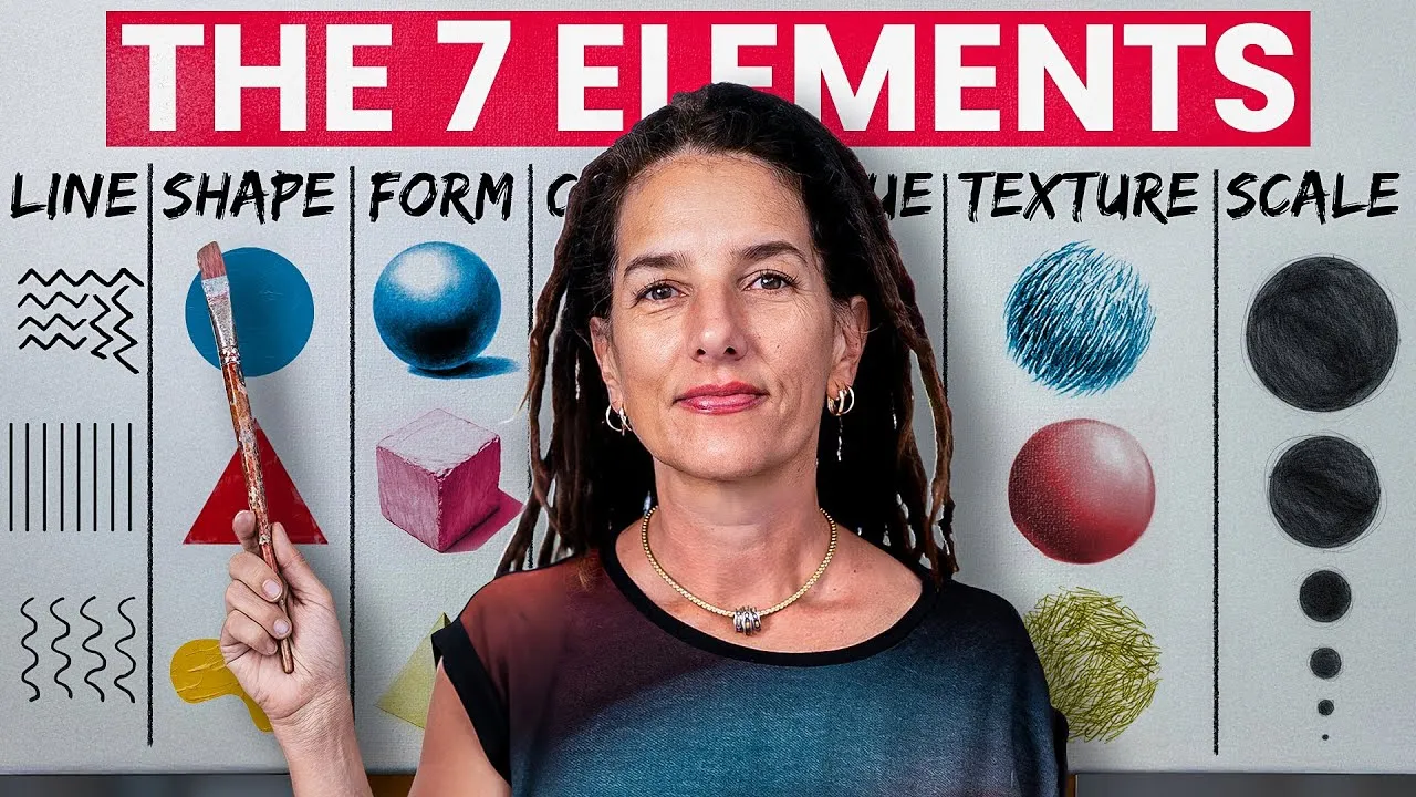
The seven elements of art are line, shape, form, color, value, texture, and scale. Style and emotion often steal the spotlight, but these seven are what silently structure every compelling painting underneath. They are your creative language, and the more fluently you speak it, the more expressive your art becomes.
This guide walks through what each element does, what it looks like in real paintings, and how to start using it on purpose.
What are the 7 elements of art?
The 7 elements of art are line, shape, form, color, value, texture, and scale: the foundational building blocks of every artwork. You will sometimes see space listed as the seventh element instead of scale. The two describe the same territory. Space is the illusion of depth in a picture, and scale is the main lever a painter pulls to create it.
It also helps to keep the elements separate from the principles of art. The elements are the raw ingredients. The principles (balance, contrast, emphasis, movement, rhythm, unity) describe how you arrange those ingredients into a composition. Learn the ingredients first. The arrangements come far more naturally once you can see what you are arranging.
One more thing before we go element by element: this is not a beginner topic you graduate from. Mastering the seven elements is how professional artists continually refine their voice and vision.
What does line do in a painting?
Line guides the eye, creates rhythm, and defines boundaries. It is the most basic mark you can make, and also the easiest to take for granted. A static, uniform line falls flat. The same contour drawn with varied weight, pressing harder in the shadows and lifting toward the light, suddenly has life in it.
Lines also carry character. Curved lines feel calm and natural. Jagged lines feel tense and energetic. Flowing lines pull the viewer through the composition like a current. Van Gogh built entire skies out of short directional strokes that function as line, and the result vibrates with movement.
Try varying line weight, direction, and type within a single drawing: curved, jagged, flowing. You will feel the difference in energy immediately.
What is the difference between geometric and organic shapes?
Geometric shapes bring order and stability, while organic shapes add movement and spontaneity. Geometric shapes are the circles, squares, and triangles with clean, predictable edges. Organic shapes are the irregular, natural ones: leaves, clouds, the silhouette of a figure.
Shapes form the basic structure of a composition, and most strong paintings combine both kinds. A landscape might rest soft organic tree masses against the hard geometry of a barn. That contrast creates visual tension and interest, and tension is what keeps a viewer looking.
A useful habit: squint at your painting until the details disappear and only the big shapes remain. If the shapes are boring, no amount of detail on top of them will fix it.
How does form turn flat shapes into three dimensions?
Form is the illusion of volume, and you create it by adding highlights and shadows to flat shape. A circle becomes a sphere the moment you give it a light side, a shadow side, and a cast shadow. That shift from shape to form is the foundation of representational painting.
The logic of light is completely learnable. The classic drawing fundamentals exercise is to render simple forms (spheres, cubes, cylinders) under a single light source until the pattern of highlight, halftone, core shadow, and reflected light becomes second nature. Practicing form builds confidence in rendering realism, and that confidence carries into abstract work too, where a suggestion of volume can make a nonrepresentational shape feel weighty and physical.
How does color change the mood of a painting?
Color shifts the mood of a painting through four properties: hue (the color family), saturation (its intensity), value (its lightness or darkness), and temperature (its warmth or coolness). Color affects mood and storytelling, so go beyond picking pretty hues and learn to control all four on purpose.
Temperature does compositional work as well as emotional work. Warm colors advance toward the viewer and cool colors recede, which means you can build depth with color alone. And because cultures have attached meaning to colors for centuries, your palette tells a story whether you intend it to or not. If that thread interests you, the symbolism of color runs deeper than most painters realize.
Why is value the most important element?
Value is arguably the most important element in painting because it creates the contrast that makes a composition readable. Value is the lightness or darkness of any area, independent of its color. Without a clear value structure, a painting lacks clarity no matter how beautiful the hues are.
The masters understood this. Caravaggio built his whole visual world on dramatic value contrast, carving figures out of darkness with a single hard light. You do not need his drama to use his lesson: learn to see and use subtle shifts in lightness and darkness, and your forms will define themselves.
The test is simple. Photograph your painting and convert it to grayscale. If it still reads, your values are working. If it turns to mud, no color adjustment will save it.
What does texture add to a painting?
Texture engages viewers on a sensory level: it lets them touch the painting with their eyes. It comes in two kinds. Real texture is physical, like thick impasto paint, scratch marks, or collage, anything that catches actual light on the surface. Visual texture is an illusion created through technique, like dry brushing that suggests weathered wood with almost no buildup of paint.
Both kinds add interest and character. Palette knife painting techniques are one of the fastest ways to get real texture working for you, and unconventional tools (rags, old cards, the wrong end of the brush) can produce marks a brush never could.
What is scale, and is it the same as space?
Scale is how a painter controls the perception of space, which is why many element lists name space as the seventh element instead. Scale influences perception directly: large shapes dominate and feel close, while small ones recede into the distance. Overlap one element in front of another and the eye reads depth immediately.
Varying scale is also one of the simplest ways to make a composition more dynamic. A painting where everything sits at roughly the same size feels static, like wallpaper. Push some things big, let others stay small, and the picture starts to breathe.
How do you start using the elements on purpose?
Pick one element at a time and study it in your own finished work. Begin noticing where your lines go static, where your shapes repeat, where your values cluster in the middle range. This kind of focused looking is how the elements move from theory into your hands, and it pairs naturally with building a vocabulary of painting techniques to act on what you see.
You do not have to do that work alone. Our oil painting techniques hub goes deeper on most of these elements, and the 2-Week Challenge gives you guided practice with feedback from working artists. Start seeing in elements, and you will start painting with greater clarity and confidence.
Frequently asked questions
What are the 7 elements of art?
Line, shape, form, color, value, texture, and scale. Some lists name space as the seventh element instead. Scale and space describe the same territory: how big things are relative to each other, and how that relationship creates the illusion of depth.
Which element of art is most important?
Many painters consider value the most important element. Value creates the contrast that makes a composition readable, defines form, and adds drama. A painting with a strong value structure holds up even when the color is simple, while weak values flatten everything.
What is the difference between the elements of art and the principles of art?
The elements are the raw ingredients: line, shape, form, color, value, texture, and scale. The principles (balance, contrast, emphasis, movement, rhythm, and unity) describe how you arrange those ingredients into a composition.
Do abstract artists use the elements of art?
Yes, often more visibly than realists do. Without a recognizable subject, an abstract painting succeeds or fails entirely on its lines, shapes, color relationships, values, and textures. In abstraction, the elements are the subject.
What to practice this week
- Make a grayscale study of one of your finished paintings to test whether its value structure reads without color.
- Fill a sketchbook page with one simple object drawn five times, changing only the line weight and line character each time.
- On a small panel, paint the same shape twice, once with thick impasto texture and once with smooth blending, and notice how each version changes the feeling.
Supplies used
About the author
More from Elli