Why Do My Acrylic Paintings Look Flat? How to Add Depth and Glow
Flat acrylics are not a talent problem. They usually come from weak value contrast, fully opaque layers, and overblended edges. Here is what causes the flatness and how to build depth and glow back into the work.

Acrylic paintings look flat for three reasons that usually show up together: the values sit too close, the layers are fully opaque, and the edges are overblended. When every part of the painting reads at the same lightness and the same hardness, the forms stop turning and the surface goes dead. Acrylic makes this worse by drying a shade darker and matte, which quietly compresses your contrast. The fix is not more detail or a better drawing. It is depth, built by widening your value range, leaving some layers transparent, and varying your edges so light has somewhere to travel.
Every artist knows the sinking feeling. The painting in front of you looks nothing like what you imagined, the colors do not sing, and part of you wants to walk away. But a flat painting is rarely a failed painting. It is almost always an unfinished one, missing the layers and contrast that give a piece its sense of life. Learning to rescue it does more than save a canvas. It teaches you what was actually missing, so the next painting starts deeper.
Why do acrylic paintings look flat?
Acrylic paintings look flat because light cannot travel through the surface. Three things block it. First, the values are too close together, so nothing turns from light into shadow with enough contrast to read as form. Second, the paint sits fully opaque, a solid wall of color with no translucent layers for light to pass through and bounce back out of. Third, the edges are overblended, so the focal point and the background read at the same distance instead of separating in space.
Acrylic adds a fourth problem on its own. It dries darker and more matte than it looks when wet, because the binder is milky when wet and clears as it dries. That shift pulls your values down a step and dulls the surface, so a painting that looked alive on the palette can settle into a flat, even gray. None of these is a drawing problem. You can have a perfectly accurate drawing and still produce a flat result, because flatness lives in value, transparency, and edge, not in line. If you want to go deeper on the medium itself, here are the 5 key differences between acrylics and oil paint that explain why acrylic behaves this way.
How do you add depth to a flat acrylic painting?
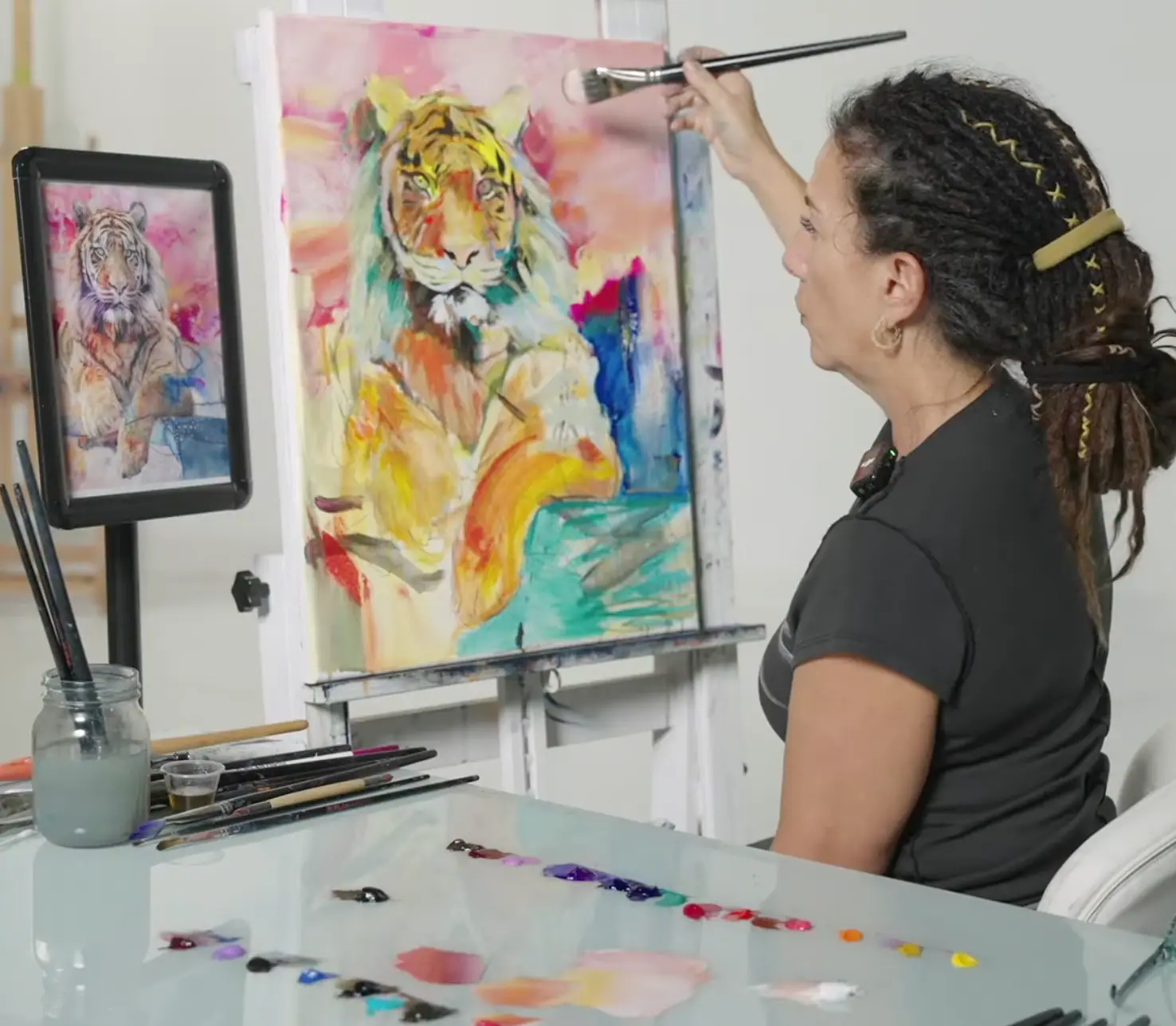
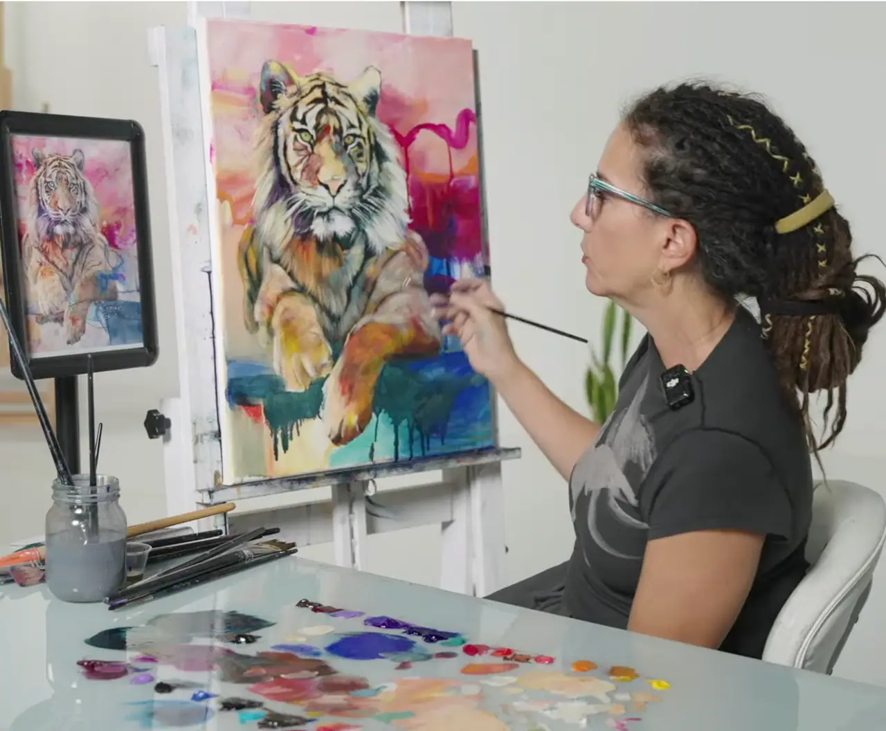
Add depth by building the painting forward in layers instead of finishing each area in one pass. Start from the background and work toward the subject, so the foreground sits on top of an established space rather than floating in a vacuum. Block in your shapes first, get the big value relationships roughly right, and only then begin refining. This systematic approach is what helps a subject feel integrated with its environment instead of disconnected or flat.
The single most powerful move is to push your values apart. Mix your darkest dark and your lightest light, then drive the painting toward both extremes at the focal point while letting the rest stay quieter. Keep your sharpest edges and strongest contrast where you want the eye to land, and soften the edges that recede. Let cooler, grayer color sit in the background so warmer, brighter color comes forward. Depth is mostly contrast and edge control, and both are skills you build, not gifts you are born with. A quick check on color wheel painting will help you mix the cooler, grayer notes that make a background recede.
Can you glaze oil over acrylic for luminosity?
Yes, and it is one of the most reliable ways to rescue a flat acrylic painting. Oil goes over fully dry acrylic safely. The reverse, acrylic over oil, does not work and will eventually fail, so the order matters. Once your acrylic underpainting is dry, you can lay thin, transparent oil glazes over it to add luminosity, depth, and the subtle color transitions that opaque acrylic struggles to reach.
This is where oils bring something special. Light dances through the translucent layers and reflects off the painting beneath, giving a sense of movement that dry, opaque acrylic cannot match. By glazing transparent color over the background first, you can unify your color relationships, build depth, and calm the chaotic areas of a painting, so the whole piece reads as one space. To understand which pigments stay translucent enough to glaze with, see how transparent oil paint works for depth and glow. The same logic powers subtractive underpainting, another layered approach that builds luminous results from the ground up.
When should you use acrylics and when should you use oils?
Use acrylics for speed and oils for depth, and you get the best of both. Acrylics dry fast, which makes them perfect for blocking in shapes, establishing your composition, and experimenting early without waiting hours between passes. Oils add the luminosity, depth, and subtle transitions that lift a painting from good to stunning. Combining the two lets you move quickly at the start and refine beautifully at the end.
This hybrid approach unlocks creativity without sacrificing quality. You are not choosing between fast and rich, you are sequencing them: acrylic to find the painting, oil to bring it to life. The result is a workflow that respects both your time and the finished surface. If you would rather stay in one medium, you can still build depth with acrylic alone by layering and glazing with mediums, and these 25 acrylic painting tips cover the habits that keep acrylic work from going flat in the first place.
Why do quality brushes matter for depth?
Quality brushes matter because flatness often starts with overblending, and cheap brushes overblend. When bristles will not hold their shape, they smear pigment instead of placing it, muddying your edges and erasing the very contrast that gives a painting depth. A good brush holds its shape, carries pigment smoothly, and lets you lay a confident stroke that keeps its edge. That control is what lets you vary your edges on purpose, sharp at the focal point, soft in the distance.
Investing in better brushes is not about luxury. It is about control, precision, and the freedom to make a decisive mark instead of fighting your tools. If your edges keep turning to mush no matter how carefully you work, the brush is often the culprit. Our guide to the best brushes for acrylic painting covers which shapes and bristles hold an edge.
How do you push through the “messy middle” without giving up?
Every painting passes through a stage where it looks its worst, and that stage is not failure, it is progress in disguise. The messy middle is the point where your values are still being established, your colors are in flux, and the piece feels unresolved. Many artists lose heart here and quit one layer too soon, mistaking the awkward phase for proof that the painting is broken.
It is not broken. It is unfinished. By trusting the process and continuing to build layers, you let the painting evolve into something richer and more cohesive than the flat version you almost abandoned. Learning to see the messy middle as a normal, necessary stage builds patience and confidence that carry far beyond the canvas. The paintings that challenge you most are usually the ones teaching you the most, and depth, contrast, and edge control are skills that compound with every piece you finish instead of walking away from.
Quick fixes for a painting that already looks flat
Start with the cheapest, fastest move and work up. Squint at the painting first. If it collapses into one even gray, your values are too close, and that is your first fix: push the darks darker and the lights lighter, especially at the focal point. Next, check your edges. If everything is equally sharp or equally soft, vary them, hard where the eye should land, soft where the form recedes.
Then add transparency. Lay one transparent glaze over the background to deepen the space and separate it from your subject, leaving the focal point untouched so it stays crisp. If you have the time, glaze oil over the dry acrylic for the richest result. Finally, varnish at the end. Varnish deepens your darks, evens the surface sheen, and recovers some of the contrast acrylic lost as it dried. Most flat paintings need only two or three of these, not all of them.
Trust the process, keep building
Growth as an artist does not happen overnight, and a flat painting is not a verdict on your ability. It is a signal that the work needs more depth, more contrast, and a few more layers. Every stroke is a chance to learn, and every painting you push past the flat stage teaches you to start the next one deeper. The skills that fix flatness, reading value, building transparent layers, controlling edges, are trainable by anyone willing to practice them.
So keep painting, and keep building depth on purpose. If you want a structured, supported way to practice these fundamentals from the start, our free Two Week Challenge walks you through making real paintings instead of just reading about them. And when you want to go further, the rest of the oil painting techniques collection is here to take you deeper.
Frequently asked questions
Why do my acrylic paintings look flat?
Acrylic paintings usually look flat for three reasons working together: the values sit too close to each other, the paint is applied fully opaque so no light passes through it, and the edges are overblended until everything reads at the same distance. Acrylic also dries a shade darker and matte, which flattens contrast further. Widen your value range, leave some layers transparent, and vary your edges, and the flatness lifts.
How do you add depth to an acrylic painting?
Add depth by building the painting in layers instead of trying to finish each area at once. Block in your shapes with acrylic, then glaze thin transparent layers over the dry surface so light travels through them and bounces back. Push your darkest darks and lightest lights further apart, keep your focal point sharp while softening edges that recede, and let cooler, grayer color sit in the background so warmer, brighter color advances.
Can you paint oil over acrylic to add depth?
Yes, and it is one of the most reliable ways to rescue a flat acrylic painting. Oil goes over fully dry acrylic safely, but never the reverse. A transparent oil glaze laid over a dry acrylic underpainting adds luminosity and soft color transitions that opaque acrylic cannot reach on its own, because light passes through the translucent oil and reflects off the layers beneath it.
Does acrylic paint dry flat or darker?
Acrylic dries both darker and more matte than it looks when wet, which is part of why finished pieces feel flatter than expected. The binder is milky white when wet and clears as it dries, shifting your values down a step. Plan for that shift by mixing your lights a touch lighter than you want and by varnishing at the end, which deepens the darks and unifies the surface sheen.
Why does my painting look flat even when the drawing is good?
A flat painting with accurate drawing almost always has a value problem, not a drawing problem. If your lights and darks are too close together, the forms will not turn, no matter how correct the shapes are. Squint at the painting until detail disappears: if it reads as one gray mass, your values are too compressed. Pushing contrast and keeping your edges varied will make the same drawing suddenly feel three-dimensional.
What to practice this week
- Squint at your finished painting until detail blurs. If it reads as one gray mass, your values are too close. Mix your darkest dark and lightest light, then push the painting toward both.
- Take a dry acrylic study you are unhappy with and lay one transparent glaze over the background only, keeping the focal point untouched. Watch how the new depth separates foreground from background.
- Paint the same simple subject twice: once fully opaque, once built in transparent layers over a blocked-in base. Compare them side by side to feel what the layers do.
Supplies used

About the author
More from Elli