Color Wheel Painting: How to Use a Color Wheel to Mix Colors With Confidence
The color wheel is not a set of rules to obey. It is a map of how colors relate, so you can stop guessing at the palette and start mixing on purpose.

A color wheel for painting is a map of how colors relate to one another, and learning to read it is how you move from guessing at your palette to mixing on purpose. You start from the three primaries, build the secondaries and tertiaries from them, and then choose a relationship that fits the painting: complementary for vibrancy, analogous for calm, triadic for balanced energy, or monochromatic to train your eye. Color stops being something you hope works and becomes something you know how to shape.
Here is the thing most painters get backwards: they treat the wheel as a set of rules to obey, when it is really a tool for seeing. Color is one of the most powerful tools you have. It carries emotion, harmony, depth, and movement across a canvas, and at its best it is not decoration but communication. The wheel is simply how you make those decisions deliberate instead of accidental. Color is one of the 7 elements of art, and the wheel is the part of that element you can actually hold in your hand.
What is a color wheel and which one do painters use?
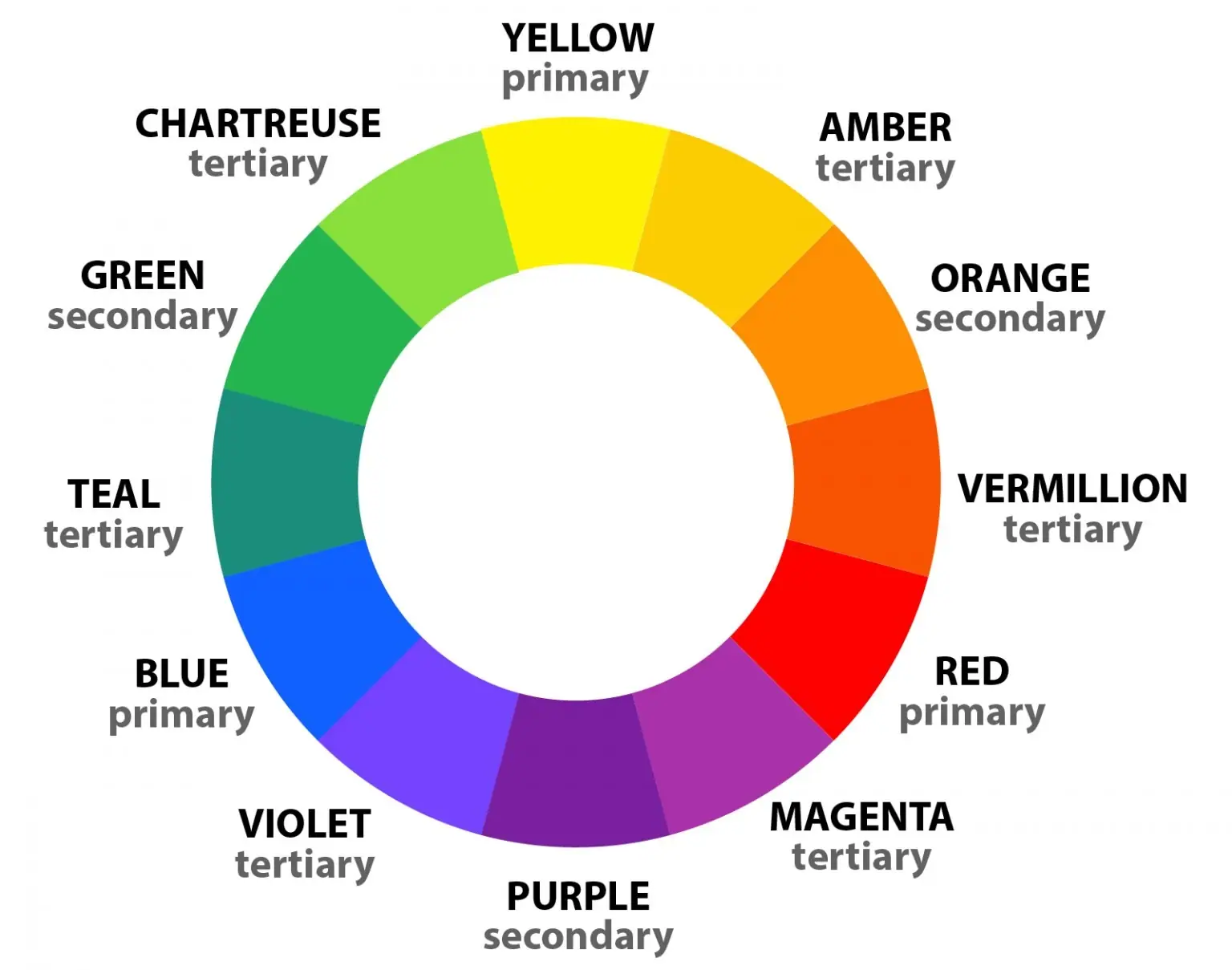
A color wheel is a visual map that shows how colors relate, and painters use the traditional RYB version built on red, yellow, and blue. That RYB system matters because it reflects how pigments actually behave on the palette, which is different from the RGB light system that runs your screen. When you are mixing physical paint, oil or acrylic, the RYB wheel is the one that predicts what will happen when two colors meet. Painters have leaned on it for centuries for exactly that reason.
Once you understand the wheel, you start to see color relationships everywhere: in light and shadow, in skin tones, in landscapes, in the atmosphere of a room. The wheel does not limit what you can do. It gives you a shared language for the choices you are already making, often without realizing it.
What are primary, secondary, and tertiary colors?
These three groups are the structure of the entire wheel, and they build outward from just three pigments. Understanding how they stack is the foundation of everything else, so it is worth getting clear before you apply any harmony rule.
- Primary colors: red, yellow, and blue. These are the three pigments you cannot mix from anything else. Every color you put on the canvas originates from these three, which is why a small set of good primaries plus white can take you remarkably far.
- Secondary colors, mixed from two primaries. These form the second ring of the wheel and expand your range. There are three of them, and each comes from combining two primaries:
- Red and yellow create orange.
- Yellow and blue create green.
- Blue and red create violet.
- Tertiary colors, mixed from a primary and its neighbor. Tertiary colors come from mixing a primary with the secondary beside it, such as blue green or red orange. These subtle variations are where painting becomes natural and expressive. They give you smoother transitions and more believable color relationships, which is what separates a flat, cartoonish surface from one that breathes.
If you want to feel this in your hands rather than just read it, mixing a hard secondary like violet is a perfect test of the system. Most muddy purples come from choosing the wrong red and blue, and the same principle applies right across the wheel. Our guide on how to make purple walks through exactly why some primaries mix clean and others turn to mud.
How do you use the color wheel to create harmony?
Color harmony is not about rigid rules, it is about relationships, and the wheel shows you which colors naturally support each other and which create useful tension. There are four harmony schemes worth knowing, and each one gives a painting a distinct feeling. You are not locked into one. You are choosing the mood you want.
- Complementary colors, for vibrancy and rich neutrals. Complementary colors sit opposite each other on the wheel, such as blue and orange, red and green, or yellow and violet. They do two opposite jobs depending on how you use them. Placed side by side, both colors appear more intense, which is how you build a strong focal point. Mixed together, they neutralize each other into rich grays and earth tones. That second trick is one of the most useful in painting: it lets you add life to shadows and control saturation without reaching for black, which tends to deaden a color. Used thoughtfully, complements bring balance and energy rather than harsh contrast.
- Analogous colors, for calm and unity. Analogous colors sit next to each other on the wheel, such as blue, blue green, and green. This harmony feels calm, unified, and natural, which is why it shows up so often in landscapes, still lifes, and atmospheric work where mood matters more than high contrast. When you work analogous, let shifts in value and temperature carry the interest so the painting does not go flat.
- Triadic harmony, for balanced energy. A triadic scheme uses three colors evenly spaced around the wheel, such as red, yellow, and blue. It creates balance and vibrancy at once, and it suits expressive, contemporary painting. The key is restraint: let one color dominate, and use the other two in muted mixtures or smaller accents so the composition stays anchored instead of shouting.
- Monochromatic, for training your eye. A monochromatic palette uses a single color across a range of values and intensities. It is simple and quietly powerful, because it forces you to see value, edges, and temperature shifts without leaning on a crowd of hues. Many painters use monochromatic studies to strengthen their foundations before they reintroduce full color, and it is one of the fastest ways to fix work that looks flat.
If you want to go deeper on what colors mean once you can mix them cleanly, the symbolism of color is the other half of this conversation: the wheel handles the how, and color meaning handles the why.
How do warm and cool colors create depth?
The wheel divides into warm and cool, and that split is one of your most reliable tools for creating depth, light, and form. Warm colors such as red, orange, and yellow tend to advance toward the viewer and feel energetic or inviting. Cool colors such as blue, green, and violet tend to recede and feel calm or atmospheric. That simple push and pull is doing structural work in a painting, not just setting a mood.
Once you understand the relationship, you can use it to make a flat surface feel three dimensional. A warm light against a cool shadow, or a cool highlight against a warm midtone, gives an object roundness and life that color alone, without that temperature contrast, never quite achieves. Most paintings that feel lifeless are not missing color. They are missing this warm and cool conversation across the form.
How do you actually use the color wheel at the easel?
In the studio, the wheel stops being theory and becomes a practical mixing tool. You are not consulting a chart so much as making decisions the chart has trained you to see. Here is what painters actually use it for once it becomes second nature.
- Mix cleaner, more intentional colors. Knowing where a color lives on the wheel tells you what to add to push it where you want, instead of stirring hopefully and hoping for the best.
- Control saturation and avoid muddy mixtures. Mud usually comes from combining colors that sit far apart on the wheel without intention. Understanding the relationships lets you gray a color on purpose rather than by accident.
- Build believable shadows with complements. Instead of darkening with black, reach for a color’s complement to neutralize it into a living, colored shadow.
- Maintain harmony across the whole painting. The wheel keeps every color choice connected to the others, so the finished piece reads as one thing rather than a collection of unrelated patches.
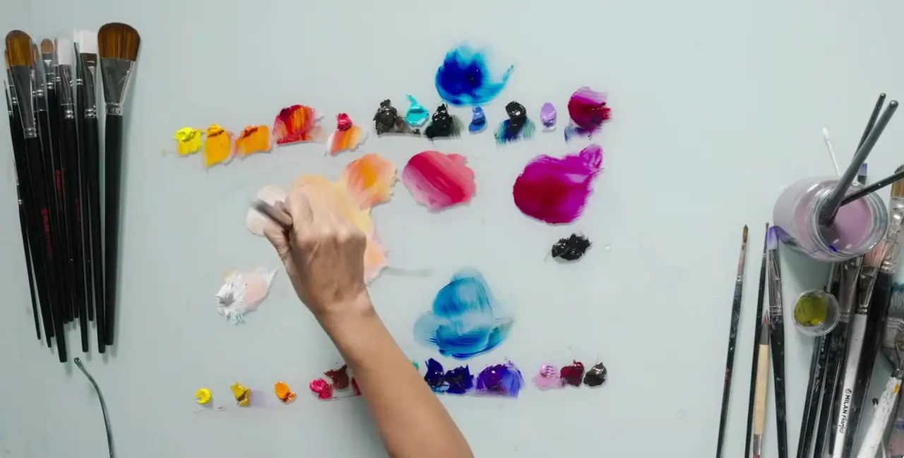
The goal at the easel is not perfection. It is awareness. Each color choice becomes deliberate and tied to the whole, and that shift alone will change how your paintings feel. Whether you work in oil or acrylic changes the mixing a little, since the two handle differently, and if you are weighing which to learn the color wheel on, here are the key differences between acrylics and oil paint.
Quick answer: how to use a color wheel in painting
A color wheel for painting maps how colors relate so you can mix on purpose instead of guessing. You build secondary and tertiary colors from the three primaries, then choose a harmony, complementary, analogous, triadic, or monochromatic, to control contrast, depth, and mood across the whole painting. Warm and cool relationships add form. The wheel is a teacher, not a cage.
Final thoughts
The color wheel is not a set of restrictions. It is a teacher. It helps you move beyond copying what you see and toward understanding why colors work the way they do, which is the difference between a painter who hopes and a painter who knows. When you learn to use it intuitively, your paintings gain confidence, clarity, and emotional strength, and color becomes something you shape rather than something you survive.
The fastest way to make this real is to mix, not just to read. If you want a structured, supported way to start putting color theory into actual paintings, our free Two Week Challenge is built to get a brush in your hand right away. When you are ready to go further with oils, the essential oil painting techniques guide is the natural next step, and the rest of the oil painting techniques collection is here whenever you want to keep building.
Frequently asked questions
How do you use a color wheel in painting?
Use the color wheel as a map for mixing and harmony, not as a rulebook. Start from the three primaries, red, yellow, and blue, to mix secondary and tertiary colors. Then choose a relationship for the painting: complementary colors for vibrancy and rich neutrals, analogous colors for calm unity, triadic for balanced energy, or monochromatic to train your eye on value. Each choice keeps your color decisions deliberate and connected to the whole.
What are the primary, secondary, and tertiary colors?
Primary colors are red, yellow, and blue, the three pigments you cannot mix from anything else. Secondary colors come from mixing two primaries: red and yellow make orange, yellow and blue make green, blue and red make violet. Tertiary colors come from mixing a primary with the secondary next to it, such as blue green or red orange, and they give you the subtle, natural transitions real paintings depend on.
What are complementary colors used for in painting?
Complementary colors sit opposite each other on the wheel, like blue and orange or red and green. Placed side by side they make each other look more intense, which is how painters build strong focal points. Mixed together they neutralize into rich grays and earth tones, which lets you gray a color or build a believable shadow without reaching for black.
What is the difference between warm and cool colors?
Warm colors such as red, orange, and yellow tend to advance toward the viewer and feel energetic. Cool colors such as blue, green, and violet tend to recede and feel calm or atmospheric. Painters use this push and pull to create depth and form, often setting a warm light against a cool shadow, or a cool highlight against a warm midtone, to make a surface feel three dimensional.
What color wheel do painters use, RYB or RGB?
Painters use the traditional RYB wheel, built on red, yellow, and blue, because it reflects how pigments actually behave when you mix them on a palette. RGB is a light based system for screens. When you are mixing physical paint, oil or acrylic, the RYB wheel is the one that predicts what will happen when two colors meet.
What to practice this week
- Mix your own secondary and tertiary colors from just three primaries plus white, and paint a small wheel by hand. You will learn more from making it than from buying one.
- Paint a monochromatic study: pick one color and render a simple subject using only its lighter and darker values. This trains you to see value before you rely on hue.
- Take one color and gray it by mixing in a touch of its complement instead of black, then compare the two grays side by side.
Supplies used
About the author
More from Elli