Textural Layering in Abstract Art: How to Build Texture That Shows Through Every Layer
Most painters add texture at the end. Our mentors put it down first, then paint over it again and again so every later layer catches on the ridges. Here's how that works, layer by layer.
Textural layering is building an abstract painting in layers of thick and thin paint, so every mark you made earlier keeps showing through the ones on top. The trick most people miss is the order. Put your texture down first, not last.
I’m Elli Milan, and I run Milan Art Institute, an online art school. Lisa Cunningham is one of our mentors (the working artists who coach our students) and a graduate of our Mastery Program. She paints this way, and she filmed a whole textured landscape masterclass showing it. A 22-minute version is in the video on this page, and the steps below follow it. Most of what follows comes from that lesson, plus two more of our mentors who build texture into their paintings.
What is textural layering in abstract art?
It’s stacking layers of different thickness, some thick and some thin enough to see through, so the painting has depth you can see and touch. A layer might be thick knife marks, a thin dark wash, a see-through glaze or a dusting of dry-brushed color.
There are two kinds of texture in play. Physical texture is paint you can feel with your fingers, like knife ridges or thick gel. Visual texture only looks rough: scratches, drips, patterns, or color dragged on with an almost dry brush. Lisa likes a mix of both, and she warns against thick paint everywhere.
Why should you add texture first instead of last?
Because a raised mark catches every layer you put over it. When you add texture at the very end, it just sits on top. When you add it first, each wash, glaze and dry-brushed color hits the ridges differently, so the texture keeps changing as the painting grows.
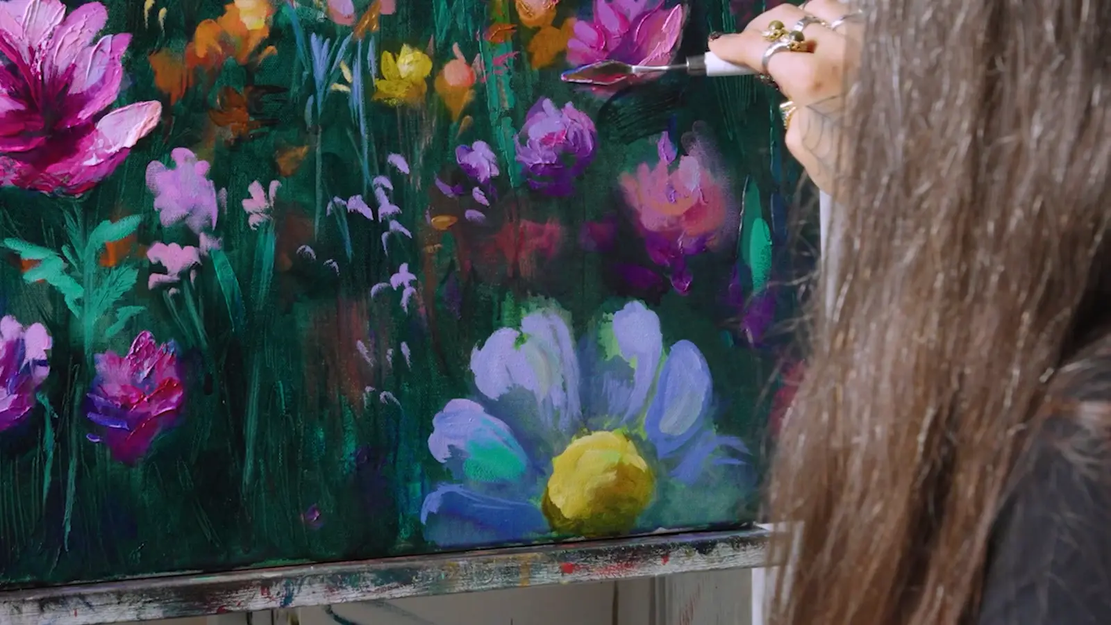
You can see it in Lisa’s painting, a field of pink, orange and purple wildflowers under a dusky lilac sky. The gold she knifed onto the texture early on still glints through the hazy sun she painted over it at the end. In her words, you put texture on at the start so you get to play with it later. Her one warning is to keep those first knife marks thin enough to dry in a reasonable time. Thick lumps on layer one slow everything after it.
How do you layer texture in an abstract painting, step by step?
Here’s the order Lisa uses, and it works for any abstract, not only landscapes. She starts in acrylic because it dries fast and finishes in oil. You could do the whole thing in oil if you have the time, or the whole thing in acrylic if you don’t paint in oil.
- Lay a bright textured base. First pick three or four colors to stick with. Lisa chose teals, raspberry pinks and blush pinks. Mix each color on your palette with a palette knife, pressing hard so it blends. Then put it on the canvas with the knife in fairly thin, textured marks. Go much lighter and brighter than you want the finished painting to be, because darker layers are coming. Cover the whole canvas. Lisa calls this bright first layer a radiant underpainting (an underpainting is simply the first layer, the one under everything else).
- Let it dry completely. Thick acrylic needs to be bone dry all the way through, which can mean overnight.
- Cover it with a dark wash, then lift out the lights. Mix a darker color with a slow-drying acrylic additive (a retarder) so it stays wet longer. Brush it over a section at a time. While it’s wet, wipe light shapes back out with a paper towel, a brush or a rubber-tipped tool called a color shaper. Your bright first layer shines through wherever you lift, and the dark stays in the cracks and low spots.
- Glaze over some areas. A glaze is a thin, see-through layer of color. Lisa brushes a deep, see-through purple over some of the lifted areas to pull them toward the colors she chose at the start, and the marks below still show. A darker glaze over a lighter color makes it glow.
- Add a second round of texture in places. Mix gloss gel (a clear acrylic paste) into the paint to thicken it and make it a little transparent. Lisa mixes gold and copper metallic acrylic into some of her colors here, and that sheen catches the light on every ridge. Put it in a few spots, not everywhere.
- Scumble over the ridges. Scumbling means dragging a nearly dry brush, loaded with paint and nothing else, lightly across the surface. The color only lands on the high points, so all that early texture lights up.
- Finish cool, then warm. Lisa switches to oil here, which is safe over dry acrylic (never put acrylic over oil). She glazes cool, see-through colors first to push areas back so they seem farther away, then adds warmer, solid color on top. For the last thick passages, she mixes cold wax medium (a soft wax paste that thickens oil paint) into her paint. She says it’s like icing a cake. Acrylic painters can use heavy gel for the same job.
Two rules hold the whole thing together. Let each texture layer dry before you cover it. And keep some of every layer showing. Lisa keeps reminding herself not to wipe out what she did the day before, because those layers are the depth.
How do layers create depth in an abstract painting?
Layers create depth by putting busy marks at the back, see-through color in the middle and the boldest texture at the front. Casey Wakefield, another of our mentors who paints abstracts, thinks of it as background, midground and foreground, even with no subject at all.
Her background is lots of marks: ink drips, scribbled lines and collage. Her midground is a cool, see-through wash over those marks, so you can still see them up close but they fade from across the room. Her foreground stacks warm colors over cool ones, adds a few last marks and the thickest texture, often oil paint mixed with cold wax.
So from across the room, one of her paintings reads as big shapes of color. Step close and you find the collage butterflies and ink drips she buried in the first layers.
What materials make texture in an abstract painting?
You don’t need all of these. Start with a palette knife and heavy gel, and add the others one at a time.
| Material | What it does | When to use it |
|---|---|---|
| Palette knife and thick paint | Ridges, scrapes and sharp edges | First layer and last layer |
| Gloss gel or heavy gloss gel | A clear paste that thickens acrylic and makes it a bit see-through | Middle layers |
| Modeling paste | A thick white paste that dries hard, so you can scratch patterns into it | First layer |
| Crackle paste | A paste that dries into cracks that catch later washes | First layer |
| Collage papers | Pattern and texture from the paper itself | Early layers |
| Dry brush (scumbling) | Color that only hits the high points | Over dried texture |
| Cold wax medium | A soft wax paste for thick, buttery oil texture (oil only) | Final layer |
Another of our mentors, who grew up with henna in India, builds whole backgrounds from modeling paste, crackle paste and gel. Then she scratches henna patterns into the wet paste with a color shaper. Her tip: flatten any peaks that stick up, because they look bad once the painting is finished. She also blends the edges of each texture into the next, so nothing looks stuck on.
How much texture is too much?
When every area is thick, nothing stands out. Lisa admits she tends to overdo things, so she watches for it. In her wildflower painting, plenty of flowers stay soft and fuzzy, and she uses thick texture to bring only a few forward.
A few checks help:
- Leave resting space. Keep a calmer area, like a sky or a flat field of color, so the eye has somewhere to rest between the busy parts.
- Vary the size of your marks. Big and small, thick and thin, in different spots.
- Soften most edges. Save the sharpest edges and thickest paint for your focal point, and let everything else relax.
- Vary your values (how light or dark each area is). Casey names too little range from light to dark as one of the most common mistakes in abstract painting. Texture can’t save flat values.
- Contrast thin with thick. Lisa’s last reminder is to move from thinner layers to thicker ones, because the difference is what makes each one show.
Then walk away. Fresh eyes are the best test of whether a layered painting is done.
Can you use textural layering in abstract realism?
Yes. In abstract realism, part of the painting looks real and the rest dissolves into abstraction, like a face that’s clear in the middle and melts into drips and brushstrokes at the shoulders. In my abstract realism lesson, I teach starting loose and abstract (drippy, splattery, expressive) and then pulling some areas toward realism with more definite brushstrokes.
The layers are what blend the two. Collage paper, spray paint, markers and bold brushstrokes sit in between the abstract parts and the real ones, so the change feels natural instead of a realistic object pasted onto a messy background.
Where should you start?
Start small. A 12 by 16 inch board and three layers will teach you more than reading about seven. Put down bright knife marks, cover them with a dark wash you lift back out, then dry-brush across the top. You’ll see the idea the moment the brush hits the ridges.
For more ways to build the marks themselves, see our texture painting techniques and abstract painting techniques guides. If you’d like an artist to look at your paintings while you learn, our Two Week Challenge is $99 for five guided pieces, two drawings and three paintings. You submit each one and a coach sends back personal feedback. For more on oil, browse our oil painting techniques.
Frequently asked questions
Do you have to let each layer dry before adding the next?
For the texture layers, yes. Thick acrylic, gel and paste need to be bone dry before you paint over them, or a wash or glaze will smear them flat. Thin oil glazes are more forgiving, and you can often keep working on top of one while it's still tacky.
What's the difference between physical and visual texture?
Physical texture is paint or material you can touch, like impasto ridges, modeling paste or cold wax. Visual texture only looks textured: scratched marks, dry-brushed color, drips and patterns that are flat to the touch. A strong abstract usually mixes both.
Can you put oil paint over acrylic texture?
Yes. Building texture in fast-drying acrylic and finishing in oil is a common way to work, and it's how our mentor Lisa Cunningham paints her textured abstracts. Go oil over acrylic, never acrylic over oil, because acrylic won't stick well to an oil layer.
What can I use to add texture to an abstract painting?
A palette knife and thick paint are enough to start. After that, try gloss gel or heavy gel mixed into acrylic, modeling paste, crackle paste, collage papers, stencils, and cold wax medium mixed into oil paint for the top layer.
How do you keep layered abstract paintings from getting muddy?
Pick a small color story before you start and keep coming back to it. Let layers dry before you cover them, clean your brush often when you're lifting paint, and use transparent colors for glazes so the layers underneath stay visible instead of turning gray.
What to practice this week
- Cover a small canvas or board with thin palette knife marks in bright, light acrylic. Let it dry overnight.
- Brush a darker, slow-drying wash over half of it, then lift the lights back out with a paper towel or a rubber-tipped tool.
- Drag a nearly dry brush of a new color lightly across the ridges and watch where it catches.
Supplies used
About the author
More from ElliKeep learning