Color Theory for Artists: The Basics of Mixing, Harmony, and Temperature
Color is the engine of a painting, and it follows rules you can learn. Here are the basics of color theory for artists: the wheel, temperature, harmony, value, saturation, and clean mixing.

Color theory is the set of rules for how colors relate to one another and what happens when you mix them. That is the whole subject in one sentence, and it is far more practical than the name suggests. Color is often the thing that draws us to painting in the first place, and it is also the biggest source of frustration. Even experienced painters step back from a finished piece and feel that something is flat, muddy, or quietly off, without knowing why. Almost always the problem is not the subject or the drawing. It is the color. And color is learnable. The basics are the color wheel, temperature, harmony, and the three properties every color carries, and once you can see those, you stop guessing and start deciding.
If your paintings feel dead even with strong composition, if choosing or mixing color makes you anxious, if your results swing wildly from one piece to the next, none of that is a talent problem. It is missing information, the kind most art classes never lay out clearly. So let us lay it out. This is the basics of color theory for artists, start to finish, in the order that actually helps you paint.
What is color theory and why does it matter for artists?
Color theory is the practical study of how colors combine, relate, and affect each other, and for a painter it is a toolkit rather than an abstraction. When you see a painting that seems to glow, where the colors feel rich and balanced and full of movement, you are not just seeing good taste. You are seeing intentional relationships between pigments, a palette built with purpose instead of guesswork, and a clear understanding of how warmth, coolness, and contrast guide the eye. Color is not only a visual component. It is the engine of the painting.
That is why theory matters even for artists who trust their instincts. Instinct gets you part of the way, then leaves you stuck on the same problems: lifeless areas, accidental mud, focal points that refuse to pop. Theory gives you the why underneath, so a bad result becomes a fixable one. The rest of this guide walks the core ideas one at a time, and each one stands on the same foundation, the color wheel.
What is the color wheel, and what are primary, secondary, and tertiary colors?
The color wheel is a circular map of hues that shows how colors are made from one another and how they relate. It starts with three primary colors: red, yellow, and blue. These are called primary because you cannot mix them from other pigments, and yet from them you can mix nearly everything else. They are the source.
Mix two primaries together and you get a secondary color. Red and yellow make orange, yellow and blue make green, blue and red make violet. Place those three secondaries on the wheel between the primaries that made them and the circle starts to fill in. Go one step further and mix a primary with the secondary next to it, and you get a tertiary color, the in-between hues like red-orange, yellow-green, and blue-violet. That is the entire wheel: three primaries, three secondaries, six tertiaries, all descended from three pigments. Mixing a basic wheel by hand is the single fastest way to understand color, and our full walkthrough on how to use a color wheel to mix colors with confidence takes you through it step by step. If you want to feel how primaries behave in practice, try mixing one specific color from scratch, like learning how to make pink in acrylics and oils, where the red you choose changes everything.
What are the three properties of color: hue, value, and saturation?
Every color you mix has three properties at once, and learning to see them separately is the skill that quietly unlocks all the rest. The first is hue, which is simply the name of the color: red, blue, green, the position it occupies on the wheel. The second is value, which is how light or dark the color is, independent of its hue. A pale sky blue and a deep navy can share a hue while sitting far apart in value. The third is saturation, sometimes called chroma or intensity, which is how vivid or muted the color is, from a pure, electric pigment down to a soft, grayed neutral.
Most beginners only think about hue. They reach for blue or red without considering whether it should be light or dark, intense or quiet. But value does most of the heavy lifting in a painting, and saturation controls where the eye lands. When you can look at any color and name its hue, its value, and its saturation, you stop fighting your mixes. You start adjusting one property at a time on purpose, which is exactly what control feels like. Color is one of the 7 elements of art, and these three properties are how it actually operates inside a painting.
What are warm and cool colors, and how does temperature create depth?
Warm colors lean toward red, orange, and yellow, and cool colors lean toward blue, green, and violet. That is temperature, and it is one of the most useful tools you have. Warm colors tend to feel close and advance toward the viewer. Cool colors tend to recede and sink back into space. Painters use that push and pull to build depth on a flat surface: warmer notes in the foreground and the light, cooler notes in the background and the shadows.
The catch worth remembering is that temperature is relative. A color is warm or cool only in comparison to the one beside it, so the same blue can read as warm next to a cooler blue and cool next to a warm red. Two of the most practical color moves come straight from this idea. If an area feels too flat, shift it slightly warmer, even by a touch, to bring it forward. If you want something to drop back, cool it down. A subtle cool tone in a background or a shadow creates depth almost instantly, with no change to the drawing at all.
What are complementary and analogous color harmonies?
Color harmonies are deliberate combinations that feel good together, and the two you will use most are complementary and analogous. Complementary colors sit directly across from each other on the wheel, such as red and green, blue and orange, or yellow and violet. Placed side by side, complements make each other look more intense, which is why a small touch of orange can set a blue painting on fire. Mixed together, those same complements neutralize each other and produce rich grays and browns, which is the cleanest way to gray a color down without reaching for black.
Analogous colors sit next to each other on the wheel, like yellow, yellow-green, and green, or blue, blue-violet, and violet. Because they share a family, they create calm, unified harmony, the quiet glow of a painting that feels all of a piece. Choosing your harmony before you begin, a complementary scheme for energy and contrast or an analogous scheme for unity and mood, is one of the most powerful decisions you can make, and it is a decision, not an accident. Color also carries meaning beyond harmony, and if you want to use it expressively, our piece on symbolism in art explores how artists load color and imagery with intention.
How do you mix colors without getting mud?
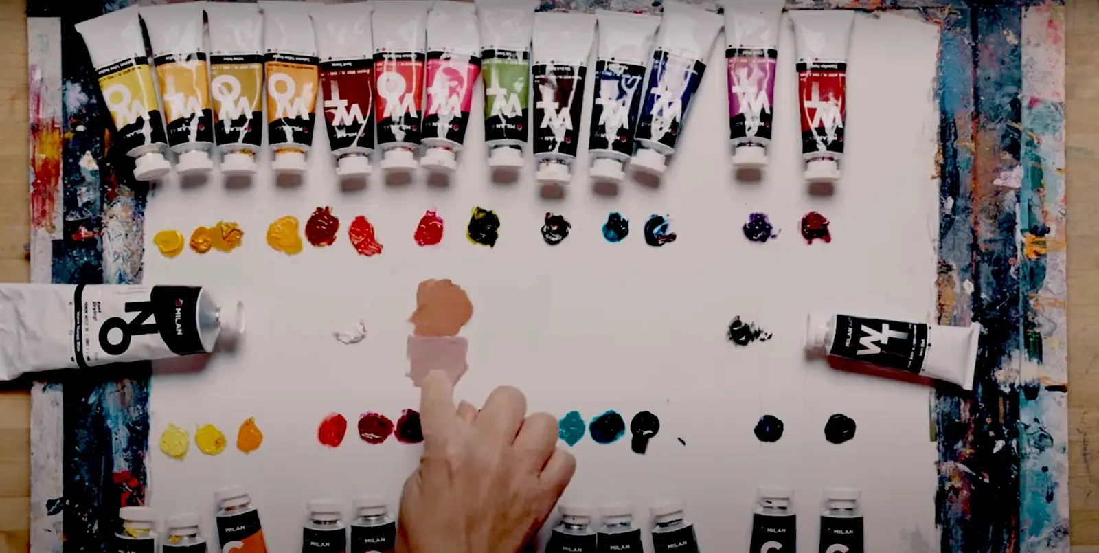
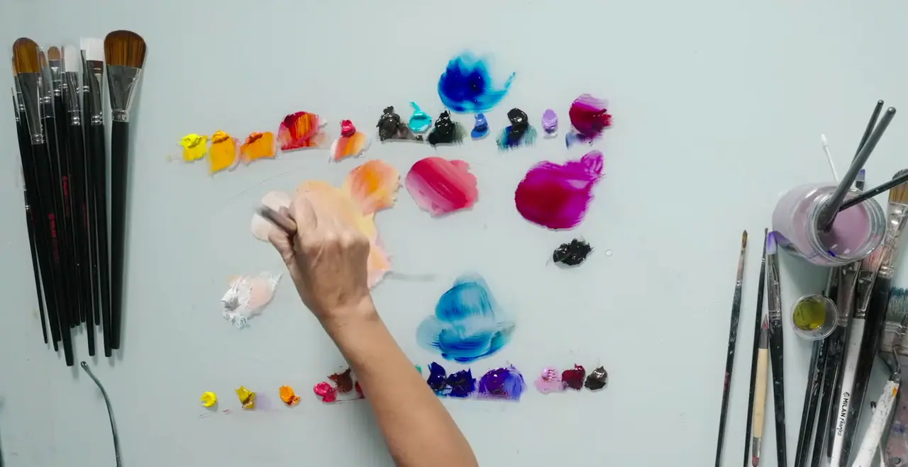
Muddy color comes from mixing too many pigments at once or dragging dirty pigment into a clean mix, and both are habits you can fix. The most common cause is reaching across the wheel and combining too many opposing colors, which neutralizes everything into a gray-brown sludge. The fix begins before you mix anything: limit your palette. Choose only a handful of colors for each painting, because fewer pigments force your mixes to stay unified and prevent accidental chaos. It helps to arrange your palette the same way every time too, so a consistent layout speeds up your mixing and helps you memorize how your colors behave.
From there, a few simple habits keep your color clean and alive. These come straight from the practice of working painters.
- Test every color before you commit it. Swipe a small mix on scrap paper or the edge of your palette so you see it in action and avoid muddy surprises on the canvas.
- Keep a clean brush when mixing light colors. Dark pigments overpower lights instantly, so start clean and add the dark slowly if you need it at all.
- Mix with a palette knife to avoid mud. A knife does not hold leftover pigment the way a brush does, so knife-mix when precision matters, then apply with the brush.
- Pair a saturated color with a neutral. Putting something bold next to something quiet makes your vibrant color sing without you having to crank up its intensity.
- Save high saturation for small pops at the focal point. A tiny area of brilliance is more powerful than flooding the whole canvas, which only cancels itself out.
- Keep a reliable rescue neutral on the palette, a gentle gray that can tone down any color when a mix turns too intense or a transition needs softening.
How do value and saturation control a painting?
Value and saturation decide whether a painting reads clearly and where the eye goes, often more than hue does. Value, the lightness or darkness of your colors, is the structure underneath everything. If the values are right, the painting holds together even before the color is perfect. If the values are muddled, no amount of beautiful color will save it. There is a simple test for this: take a quick phone photo of your work in grayscale. Stripped of color, you see whether your value structure actually supports your color choices. If the painting still reads in black and white, your color will read too.
Saturation is the other lever, and it controls attention. The eye is drawn to the most intense color in the field, so high saturation is precious and should be spent deliberately. Keep your most vivid notes for key moments, especially the focal point, and let the rest of the painting sit quieter around them. One more habit ties value and saturation together: step back regularly. Color and contrast look different from a distance, so stand back every few minutes to judge the overall temperature, balance, and transitions before you keep going.
How do you actually start learning color theory?
Start by mixing, not memorizing, because color theory only sticks when your hands do it. Read the wheel a hundred times and it stays abstract. Mix a basic color wheel from three primaries one afternoon and it becomes yours. Pick a single red, yellow, and blue, mix every secondary and a few tertiaries, and watch the whole spectrum unfold from three tubes. Then make a value scale of one color, five clean steps from light to dark, so you feel value as its own dimension separate from hue. None of this requires a big kit or a perfect studio. It requires the willingness to make a few ugly swatches on the way to understanding.
That is the honest path with color, and with painting in general: a little real practice beats a lot of reading. Limit your palette, learn the wheel by mixing it, see hue, value, and saturation as three separate things, and use temperature and harmony on purpose instead of by accident. Do that and the muddy, lifeless results start to fall away, replaced by color you chose. If you want a structured, supported way to build these fundamentals from the ground up, our free Two Week Challenge is made for exactly the beginner who is tired of guessing, and the rest of our oil painting techniques collection is here when you want to go deeper. Color was never magic. It was always a craft, and crafts can be learned.
Frequently asked questions
What is color theory in simple terms?
Color theory is the set of rules for how colors relate to each other and what happens when you combine them. It explains the color wheel, why some color pairs feel harmonious and others clash, how warm and cool tones create depth, and how to mix the color you want instead of the muddy one you got. For painters it is less a theory and more a practical toolkit for controlling color on purpose.
What are the three basic properties of color?
Every color has three properties: hue, value, and saturation. Hue is the color itself, such as red, blue, or green. Value is how light or dark it is, from near white to near black. Saturation is how intense or muted it is, from a vivid pure pigment to a grayed neutral. Once you can see all three separately, mixing and matching color gets far easier.
What is the difference between warm and cool colors?
Warm colors lean toward red, orange, and yellow, and they tend to feel close and advance toward the viewer. Cool colors lean toward blue, green, and violet, and they tend to recede and create depth. Temperature is relative, so a color is warm or cool compared to the one next to it. Painters use this push and pull to build space and guide the eye.
What are complementary and analogous colors?
Complementary colors sit opposite each other on the color wheel, like red and green or blue and orange, and placed side by side they make each other look more intense. Analogous colors sit next to each other, like yellow, yellow-green, and green, and they create calm, unified harmony. Both are color schemes you can choose on purpose before you start a painting.
Why do my colors turn out muddy?
Muddy color usually comes from mixing too many pigments at once, especially colors from opposite sides of the wheel, or from a dirty brush dragging leftover pigment into a clean mix. Limit your palette, keep your brush or knife clean when mixing lights, and test each mix on scrap before you commit it to the canvas. Most mud is a mixing habit, not a lack of talent.
What to practice this week
- Mix a simple color wheel from just three primaries: a red, a yellow, and a blue. Make each secondary (orange, green, violet) and a few tertiaries, so you feel how the whole wheel comes from three pigments.
- Take one color and make a value scale of it: line up five steps from very light to very dark by adding white or a darker pigment, without changing the hue.
- Photograph a finished painting in grayscale on your phone. If the value structure reads clearly in black and white, your color is doing its job. If it goes flat, your values, not your colors, need work.
Supplies used
About the author
More from Elli