How to Make Pink: The Right Red for Acrylics, Oils, and Hot Pink
Red plus white is only half the recipe. The red you reach for decides whether your pink glows or goes muddy.

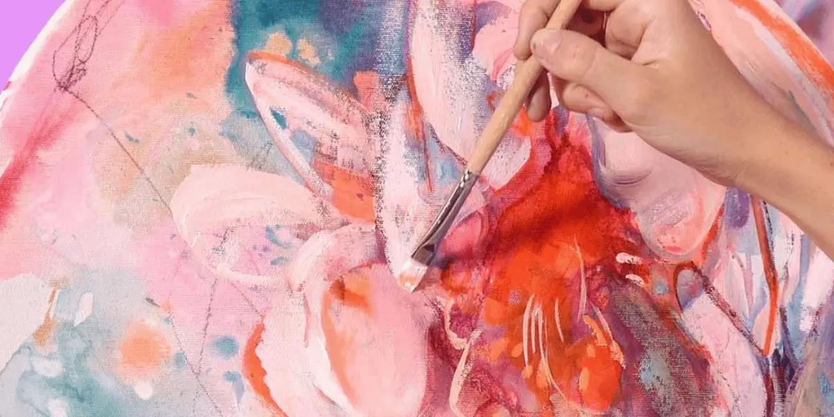
Pink is red plus white. Every painter learns that recipe first, and it works, right up until your pink dries dull, chalky, or closer to salmon than the color you imagined. The problem is almost never the white. It is the red.
Reds with blue undertones, like magenta and quinacridone red, mix into cool, vivid pinks. Reds with yellow undertones, like cadmium red, mix into warm pinks that lean coral. Your medium matters too: acrylics dry slightly darker than they look wet, while oils hold their color and stay workable much longer. Those differences run deeper than one color, so if the two paints still feel interchangeable to you, start with the 5 key differences between acrylics and oil paint. Once you control the red and respect the medium, you can mix any pink on purpose instead of by accident.
What colors make pink?
Red and white make pink, and the specific red you choose decides which pink you get. Magenta and quinacridone red carry blue undertones, so they produce cool, bright pinks. Cadmium red carries yellow undertones, so it produces warm pinks that drift toward coral and peach. For hot pink, start with magenta and add only a small amount of white.
This is why two painters can follow the same red plus white instructions and land on completely different colors. They were never holding the same red. Undertones rule every secondary mix on your palette, which is why making purple comes with the exact same warning about choosing your red carefully.
Why is your pink not coming out right?
When a pink goes wrong, the cause is almost always one of three things: an impure red, too much white, or a medium shift you did not plan for.
Earth-tone reds like Venetian red dull a pink the moment white touches them. Stay with pure, saturated reds such as primary red, quinacridone red, or magenta, and keep your mixing water and tools clean so nothing else sneaks into the color.
Too much white is the second trap. White lightens a pink, but it also drains saturation, and past a certain point the mix turns chalky instead of soft. Add white in small steps and stop a little sooner than you think you should.
The third is the medium itself. Acrylics dry slightly darker than they appear wet, so a pink that looks perfect on the palette can dry a step duller on the canvas. Mix one shade lighter than your target. And mix with a palette knife rather than a brush: you get a cleaner, more even color, and cleanup is far easier on your brushes.
How do you make pink with acrylic paint?
Start with a magenta-based red, such as quinacridone red, and add titanium white a little at a time. Here is the full process:
- Squeeze out quinacridone red, primary red, or magenta as your base.
- Add titanium white gradually until you reach the lightness you want.
- Mix thoroughly. Acrylics dry quickly, and an uneven mix leaves streaks in your passage.
- Aim one shade lighter than your target, because acrylics dry slightly darker than they look wet.
- Mix more than you think you need. Acrylic dries fast, and matching a custom pink later is harder than mixing extra now.
For pastel pink, keep adding white in small amounts until the color turns soft and powdery. If the mix starts to feel chalky or lifeless, a tiny touch of the original red brings it back.
How do you mix pink with oil paint?
Start with alizarin crimson or quinacridone red, then choose your white deliberately, because in oils the white changes the character of the pink.
- Lay out alizarin crimson or quinacridone red as your base. For a warm, coral pink, reach for cadmium red instead.
- Lighten with zinc white for a transparent, luminous pink. Titanium white covers better, but it can push the mix toward an opaque, chalky look.
- Use the long open time. Oils stay wet on the canvas, so you can keep blending and adjusting the tone as the painting develops.
How do you make hot pink and bright pink?
Hot pink starts with the most saturated cool pink on your palette, magenta, opera pink, or permanent rose, lightened with as little white as possible.
In acrylics, use opera pink, magenta, or fuchsia as the base. Add a small amount of white for opacity, but stop before the intensity fades. If you want a true neon edge, a touch of fluorescent pink will take the mix where ordinary pigments cannot.
In oils, build on magenta or permanent rose with minimal white, then apply the color in thin layers or glazes. Light passes through a glaze and bounces back off the ground, which makes the pink glow in a way a thick opaque stroke never will.
Hot pink earns a guide of its own, with pigment names and full recipes: read how to make hot pink paint.
How do you keep pink vibrant in a finished painting?
You protect a pink’s vibrancy with what you put next to it and underneath it, not only with what you mix into it.
Keep earth tones out of the mix entirely. If a pink runs too warm, neutralize it with the smallest possible touch of green or blue. Better still, place those complements beside the pink instead of inside it: a cool green or deep blue neighbor makes a pink read brighter than it actually is.
Then think about the ground. Paint your pinks over a white or light-colored surface, because a dark ground swallows the brilliance of every transparent pink you lay on top of it.
What does pink mean in art?
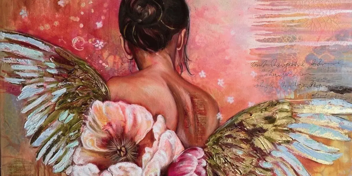
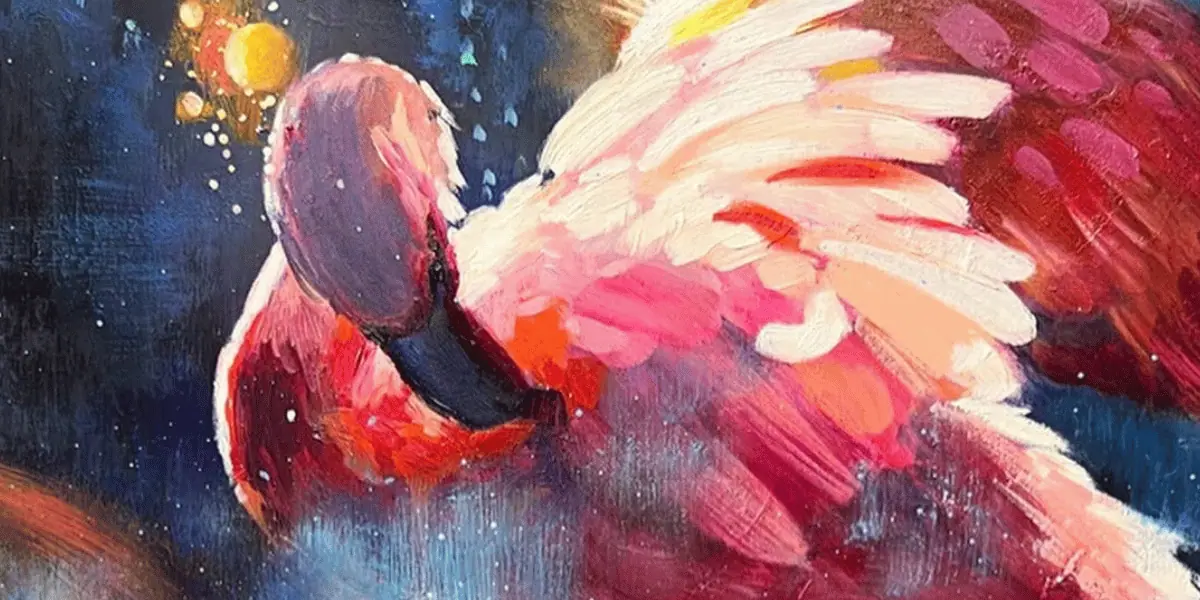
Pink reads as love, tenderness, and warmth at its softest, and as boldness, energy, and rebellion at its most saturated. Soft pinks bring peace and nurture into a painting. Hot pink brings play and defiance. Few colors cover that much emotional ground.
It also carries real history. In the 18th century, pink was worn by men and women across the European aristocracy as a mark of sophistication and luxury. The strong association with femininity came much later, in the mid-1900s, driven by consumer products aimed at young girls. Hot pink arrived in that same era, when synthetic pigments made brighter, more saturated hues possible. Elsa Schiaparelli built a fashion identity around Shocking Pink, and Pop artists like Andy Warhol used similar neon hues to upend traditional palettes. Henri Matisse leaned on pink in his Fauvist canvases, and Mark Rothko floated entire fields of it to pull viewers inward.
If you want to choose colors for what they say and not just how they look, the symbolism of color is worth a full read.
Frequently asked, answered fast
Mixing pink well teaches the lesson underneath all color mixing: undertones decide everything. Pick the right red and the rest is adjustment. You will find more mixing and paint handling guides in the oil painting techniques hub, and if you want to practice with real feedback from working artists, the 2-Week Challenge is a friendly place to start.
Frequently asked questions
What two colors make pink?
Red and white. The red you choose sets the temperature: magenta or quinacridone red mixes into cool, bright pinks, while cadmium red mixes into warm, coral pinks.
Why does my pink look muddy or dull?
The red is usually the problem. Earth-tone reds like Venetian red dull a pink instantly, and dirty brushes or mixing water do the same. Start from a pure, saturated red and mix with a clean palette knife.
Does pink dry darker in acrylic paint?
Yes, slightly. Acrylics darken a little as they dry, so mix your pink one shade lighter than the color you want on the finished canvas.
What red makes the best hot pink?
Magenta, opera pink, or permanent rose. Add only a small amount of white so the mix stays saturated, and add a touch of fluorescent pink if you want a neon edge.
What to practice this week
- Mix the same pink twice, once from cadmium red and once from magenta, and label both swatches so you can see how the red sets the temperature.
- Paint a five-swatch gradient from pure magenta to nearly white and mark the exact point where the pink turns chalky.
- Tone down a too-warm pink with the smallest possible touch of green, then bring it back with more red, so you learn how fast complements work.
Supplies used

About the author
More from Elli