Why Do My Paintings Look Cartoonish? How to Make Them Look Realistic
The cartoon look is not a talent problem. It comes from flat value, simple color, and hard outlines. Fix those, and your paintings start to read as real.

Paintings look cartoonish for three reasons working together: the value range is too flat, the color is too simple, and every edge is a hard outline. Cartoons are built that way on purpose, with bright local color, even lighting, and bold black lines. When your painting copies those habits by accident, it reads as graphic instead of real. To make your work look realistic, you fix those three things first, then layer in proportion, contour, perspective, and form. None of it requires talent. All of it is learnable.
Here is the thing most artists get wrong when they ask why their paintings look like cartoons: they assume the problem is their hand, or some gift they were not given. It almost never is. The cartoon look is a stack of small, fixable choices, and once you can name them you can correct them one at a time. Below are the eight that matter most, in roughly the order they move the needle.
Why does flat color make a painting look cartoonish?
Color looks cartoonish when it stays too simple, with one flat local shade per object instead of the many colors that actually live there. A cartoon leans on bright primaries with little variation. Real surfaces do not work that way. To break the cartoon look, reach for a richer, more nuanced palette.
Start by pushing past the obvious color of a thing. A red rose is not just red. It carries yellow, pink, orange, blue, violet, and even a green complement where the light shifts. Skin is the clearest example of all: it is never one tube color but a mix of reds, yellows, and even blues that change with the light and the room around it. Watch how warm and cool tones trade places across a form, and let analogous colors, the ones sitting next to each other on the wheel, carry your transitions so they feel natural instead of stark.
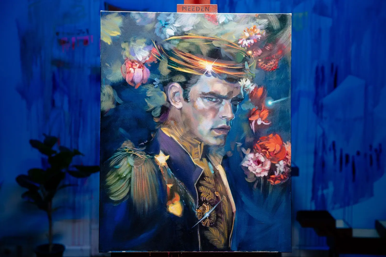
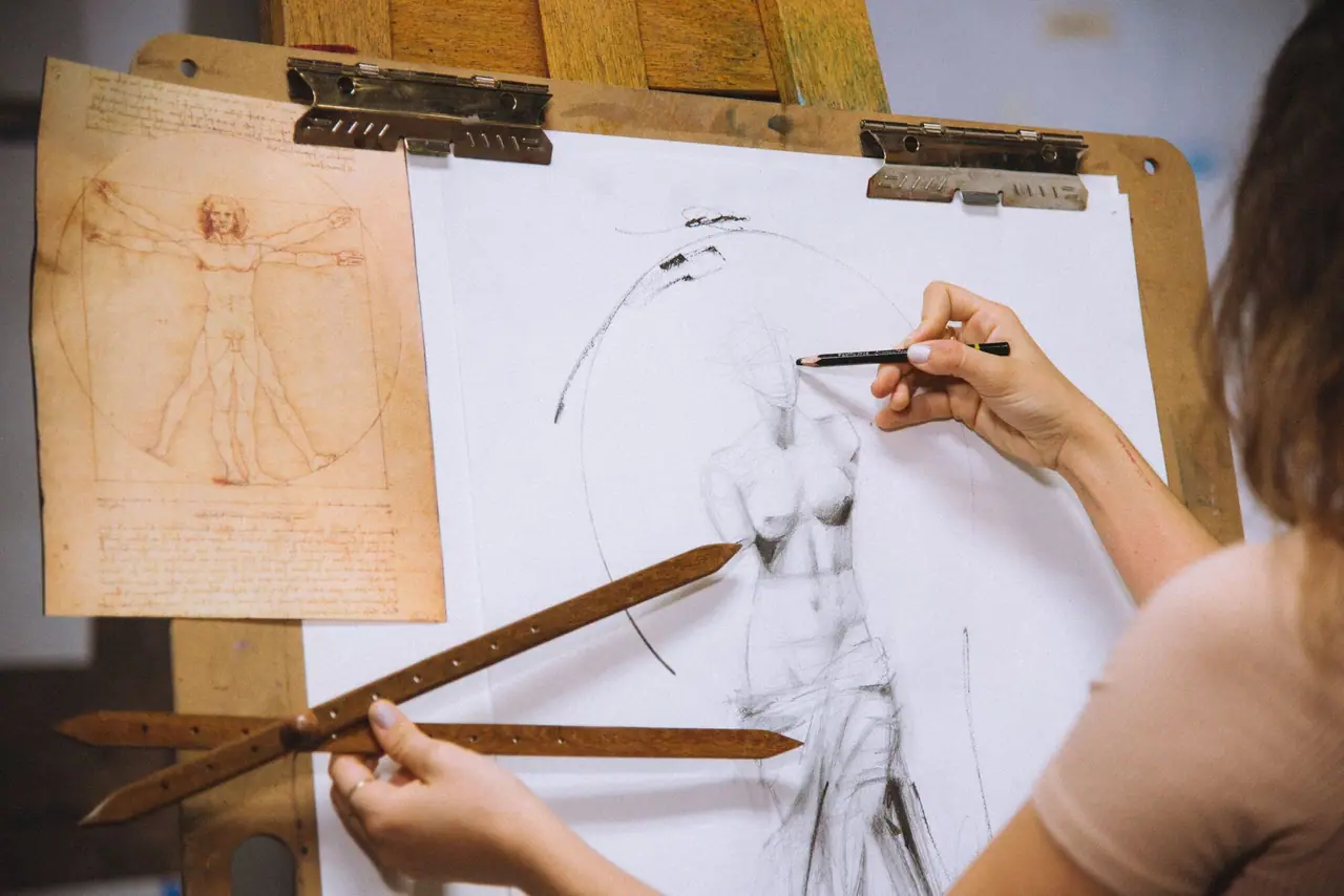
Look closely at the skin in the painting above. Blue, pink, peach, orange, teal, purple, yellow, cream, white, tan, and brown all sit inside it. That is the opposite of a single cartoon color, and it is a large part of why the figure reads as real. If mixing color confidently is where you get stuck, color wheel painting walks through how to mix with intention instead of guessing.
How do edges change whether a painting looks real or cartoonish?
Hard, uniform outlines are the single most cartoonish habit, because real objects do not have a black line drawn around them. What we read as an edge is usually just a change in value, color, or focus. Cartoons use clean bold outlines to separate areas, which works for animation but makes a painting feel flat and two dimensional. The fix is edge variety.
Use the full range, from soft, blurry transitions to sharp, crisp lines. Soft edges suggest depth and volume, so in a portrait you might melt the edge along a jaw or cheekbone into the background, the way your eye actually perceives a turning form. Save crisp edges for your areas of focus, the eyes, the contour of a hand, anywhere you want to pull the viewer’s attention. When the sharpness of your edges varies on purpose, the painting gains a three dimensional quality and stops looking graphic. This is also the honest answer to drawing without lineart: you do not outline the form, you let value and edge do the work a line used to do.
How does value make a painting look three dimensional?
Value, the lightness or darkness of a color, does more to create realism than anything else, and a flat value range is the most common reason a painting looks cartoonish. Cartoons use a limited set of values, which keeps everything looking flat. Realistic work uses the full scale, from the deepest shadow to the brightest highlight.
Experiment with chiaroscuro, the strong contrast of light and dark that means “light-dark” in Italian and that masters like Caravaggio and Rembrandt used to give their figures real weight. Push the contrast between light and shadow and your subjects start to feel solid. Then check the whole value structure: are your darkest darks and lightest lights placed where they guide the eye and build depth, and are there enough mid-tones to carry smooth transitions between them? Get value right and the flatness simply disappears.
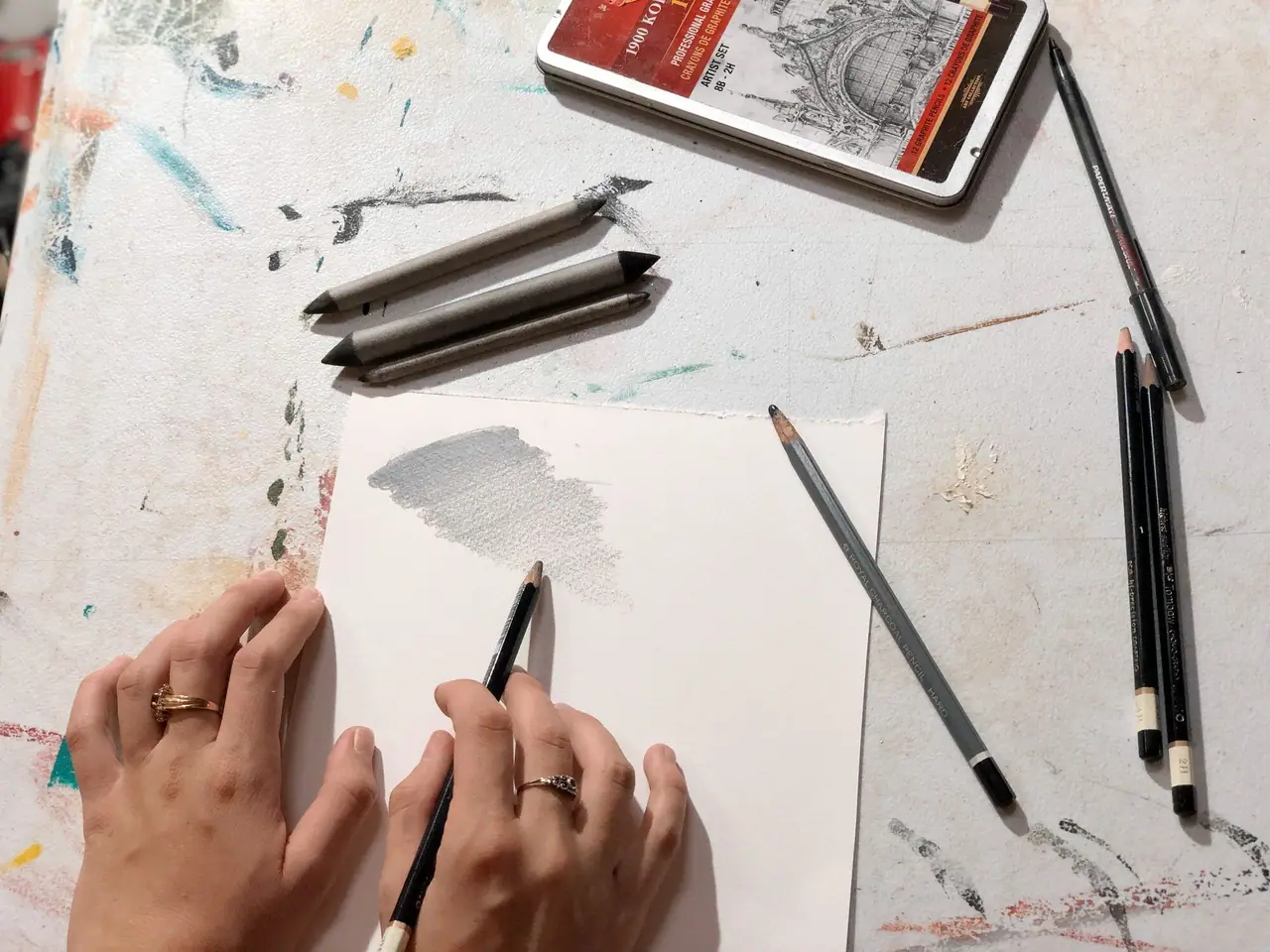
A smooth gradient like the one above is worth practicing on its own. If you can shade a clean transition from dark to light, you can turn a flat shape into a believable form.
Why does oversimplified contour read as cartoonish?
Contour looks cartoonish when the outer lines of a form get smoothed into easy, exaggerated curves that skip the complexity of the real thing. Stylized animation simplifies on purpose, but in a painting that simplification reads as fake. The fix is to study the actual edges of your subject and honor their variation.
A tree branch is not a smooth curve. It twists, bends, and breaks in irregular ways that give it character. The human body is the same, full of contours that shift with the light, the muscles underneath, and the texture of the skin. You do not need to record every tiny detail, but you should represent the real variation instead of replacing it with a clean arc. A useful trick is to mix straight and angled edges into curves that would otherwise feel too perfect, because a slightly angular contour almost always reads as more observed and more real.
How does atmospheric perspective add depth?
Atmospheric perspective fights flatness by changing the color and clarity of objects as they recede, the way your eye actually reads distance. Things far away look lighter, cooler, softer, and less detailed than things up close. Build that into a painting and you create real space instead of a flat backdrop.
To do it, soften the edges, mute the colors, and drop the detail on anything in the distance. In a landscape, the far mountains or trees should sit lighter and vaguer than the foreground, which pulls the viewer into the scene and makes it feel deep and immersive. Cartoons rarely bother with this, which is part of why they sit flat on the page. One layer of atmospheric perspective can transform how much room a painting seems to hold.
How do gesture and form bring a subject to life?
Gesture and an understanding of form give a subject the living, dimensional quality that stiff cartoon figures lack. Gesture drawing is a quick, fluid way of sketching that chases the overall action or feeling of a pose instead of the details. Practice it and your paintings pick up movement and energy rather than the rigid, posed look of a cartoon character.
Alongside gesture, study form, which is how light wraps around a three dimensional object and how shapes occupy space. When you understand form, you can render the real volume and mass of a subject, and that understanding works hand in hand with your value and shading. Accurate measurement helps here too. A proportion tool lets you lay down correct measurements before you commit, and a proportional divider is worth learning if your shapes keep drifting toward the exaggerated proportions that read as cartoon.
How does a focal point make a painting look less flat?
A clear focal point breaks the uniform, flat look of cartoon art by giving the eye somewhere to go. Cartoons often keep focus even across the whole image, which flattens everything. Placing a deliberate focal point creates a sense of depth and importance and walks the viewer through the painting.
Build that focal point with contrast: more saturated color, stronger value, or sharper edges in the one area you want to own the attention, while everything around it stays softer and quieter. That contrast does double duty, adding depth and emphasizing the key part of your composition so the piece feels dynamic instead of evenly weighted. A strong focal point gives the painting a clear visual hierarchy, which is exactly what flat, uniform cartoon imagery is missing.
How does dappled light add realism?
Dappled light, the broken pattern of light and shadow that falls when light filters through something like leaves, adds the kind of complexity a flat cartoon never has. Cartoon lighting tends to be even and uniform, which keeps the world simple and unreal. Real light is messier, and copying that mess is what makes a scene believable.
In a landscape, dappled light lets you show sunlight breaking through foliage and scattering irregular patches across the ground or a figure. It adds visual interest and signals a real, lived-in environment. Master the way broken light moves across a surface and you trade the flatness of cartoon lighting for a rich, textured realism. If you want to push further into painting light itself, how to paint glow covers rendering luminous, glowing light in acrylic and oil.
From flat to real: putting it together
Realism is the sum of these eight honest observations, not a single fix. Often it is the small adjustments stacking up, a little more warmth in the color, a few softened edges, a contour line you actually looked at, that move a painting from flat and graphic to solid and alive. Developing a realistic style is an ongoing practice, so experiment, refine, and let your eye lead your hand.
The fastest way to put all of this into reps with real feedback is our free Two Week Challenge, a guided way to make paintings instead of just reading about them. If you want to keep sharpening the fundamentals underneath the cartoon look, the oil painting techniques collection has the rest of the path.
Frequently asked questions
Why do my paintings look cartoonish?
Paintings usually look cartoonish for three reasons working together: the value range is too flat, the color is too simple, and every edge is a hard outline. Cartoons are built that way on purpose, with bright local color, even lighting, and bold lines. When your painting copies those habits by accident, it reads as graphic instead of real. Fixing value, color, and edges is what brings it back toward realism.
How do I make my paintings look more realistic?
Work on value first, because the lightness and darkness of your shapes does more to sell realism than anything else. Then mix complex color instead of one flat local shade, vary your edges from soft to crisp, and measure real proportion and contour rather than smoothing everything into easy curves. Add atmospheric perspective for depth. Realism is the sum of those honest observations, not a single trick.
How do you draw without lineart and still keep the form?
Drop the outline and let value carry the form instead. Real objects do not have black lines around them; what reads as an edge is actually a change in value, color, or focus. Build the shape by painting the light and dark masses and softening or sharpening the boundaries between them. Where a cartoon would use a line, a realistic painting uses a transition.
What makes a painting look flat instead of three dimensional?
Flatness comes from a narrow value range, uniform edges, and even lighting. If your darks are not dark enough and your lights are not light enough, the form has nothing to turn on. If every edge is equally sharp, nothing recedes. Add a full value range, vary your edges, and use directional light and atmospheric perspective, and the same shapes start to feel solid.
Does fixing the cartoon look take talent or just technique?
It is technique, not talent. The cartoon look is a set of habits, flat value, simple color, hard outlines, and each one has a concrete fix you can practice. Studying value, mixing richer color, and varying your edges are learnable skills that improve with reps. Plenty of artists who once painted flat, graphic work now paint with real depth, purely from practicing these fundamentals.
What to practice this week
- Paint a value study in only black, white, and gray: choose one photo and render just the light and dark shapes, with your darkest dark and lightest light both present.
- Take one object and paint its edges three ways, fully soft, medium, and crisp, so you can feel how edge variety creates depth.
- Mix a skin tone or a single object using at least five colors instead of one, and notice how much more alive it looks than a flat local color.
Supplies used

About the author
More from Elli